Let me share my thoughts on one of the smallest shops I visited while in Paris in March 2024, that of skater brand Element.
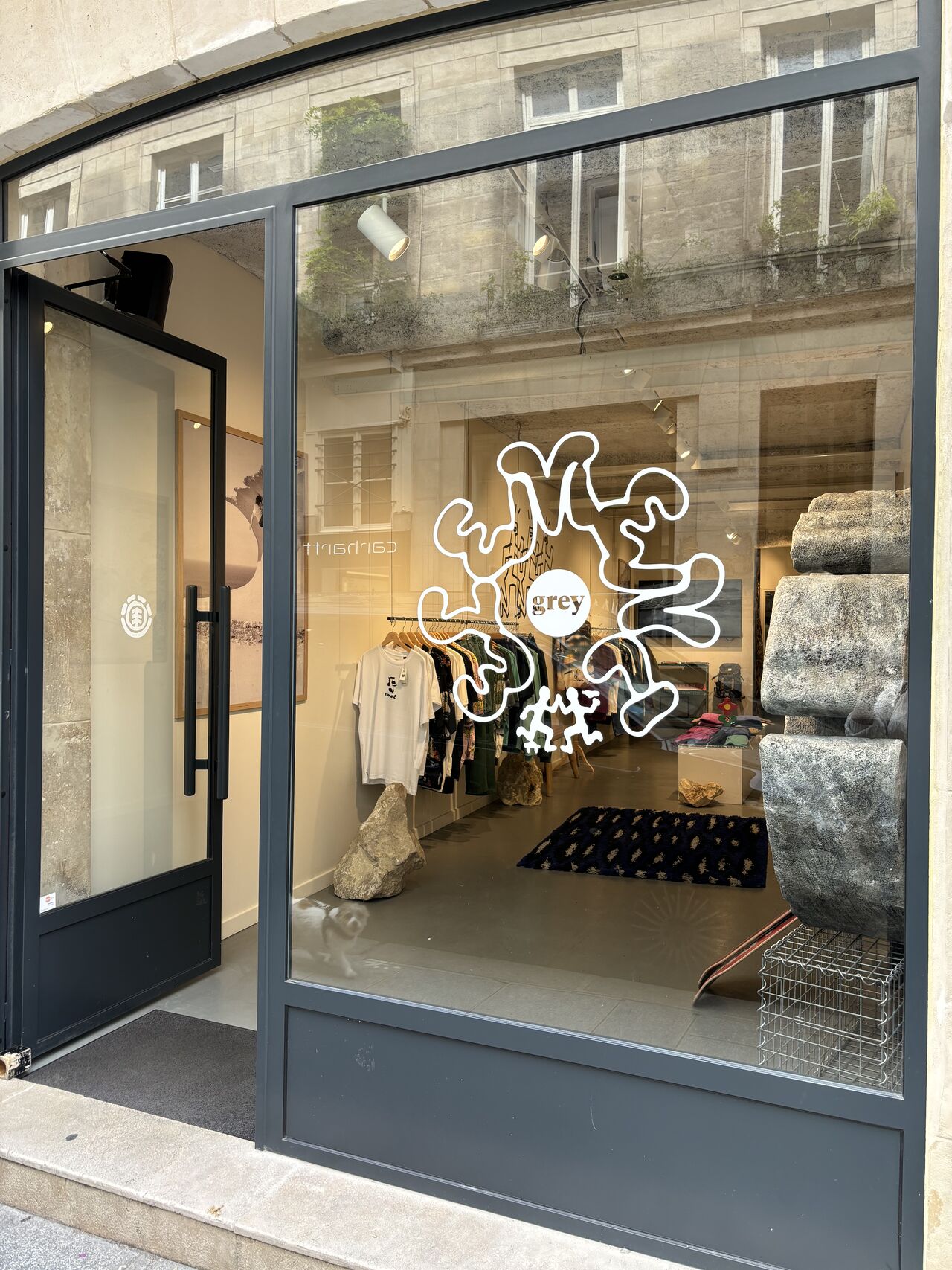
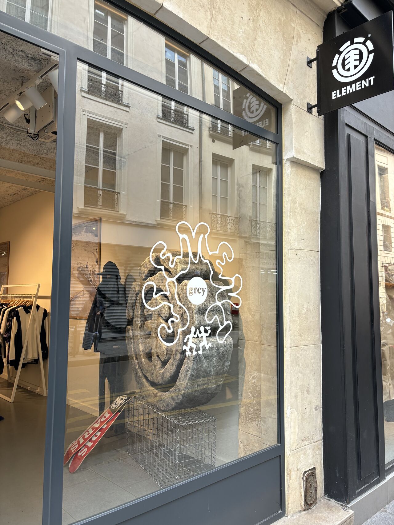
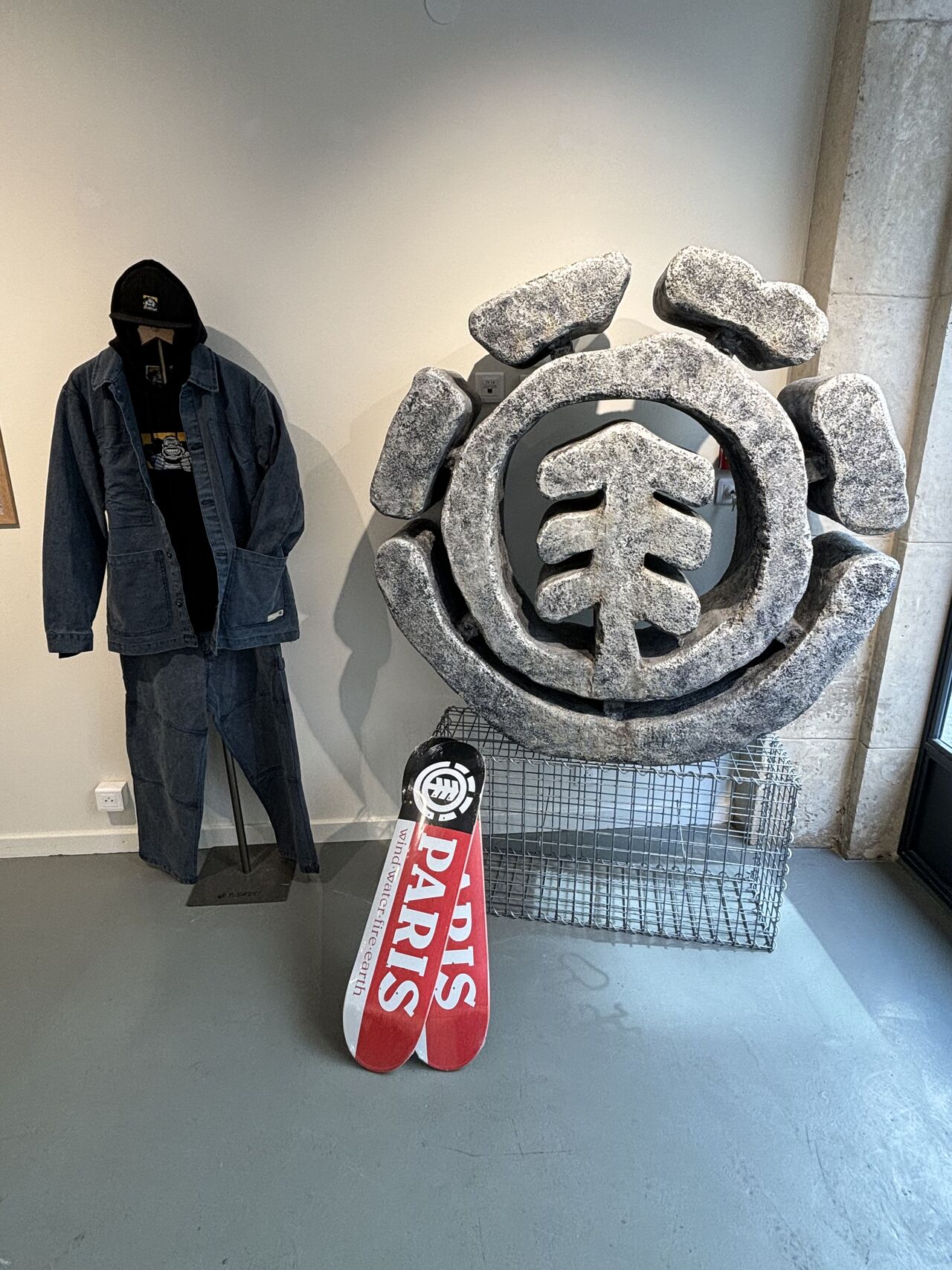
I admit I had never heard of this brand and so wasn’t particularly looking for its shop. The shopfront also didn’t do much to introduce me to the brand or tempt me into the store… except for one relatively hard to miss element: a massive stone carving in the window display!
As usual, I asked the sales assistant if I could take some photos, also as a way to open conversation about the retailer and store. I was kindly briefed on the brand’s history and values and also told that the store design was regularly changed to keep the targeted community “on its toes”.
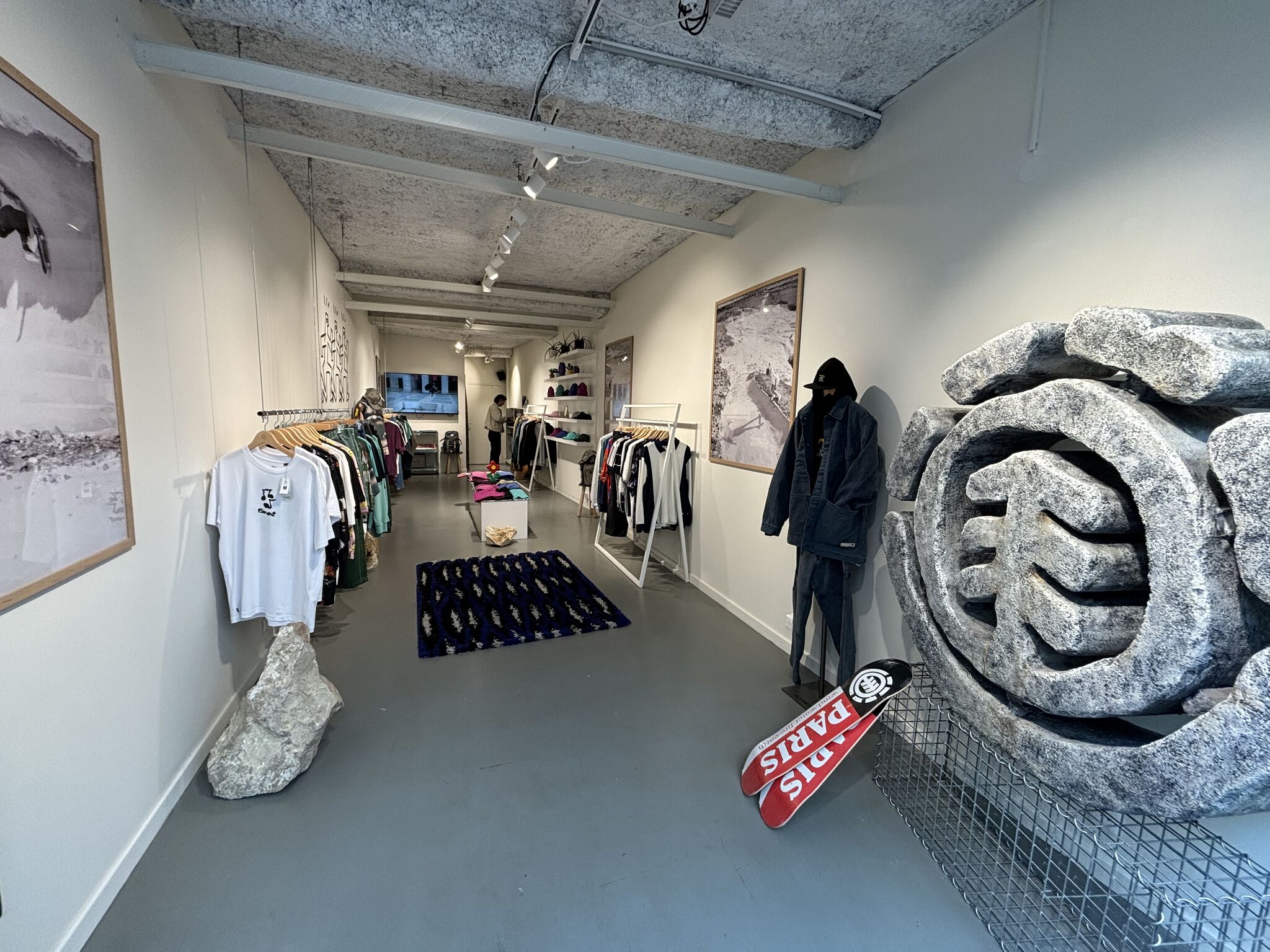
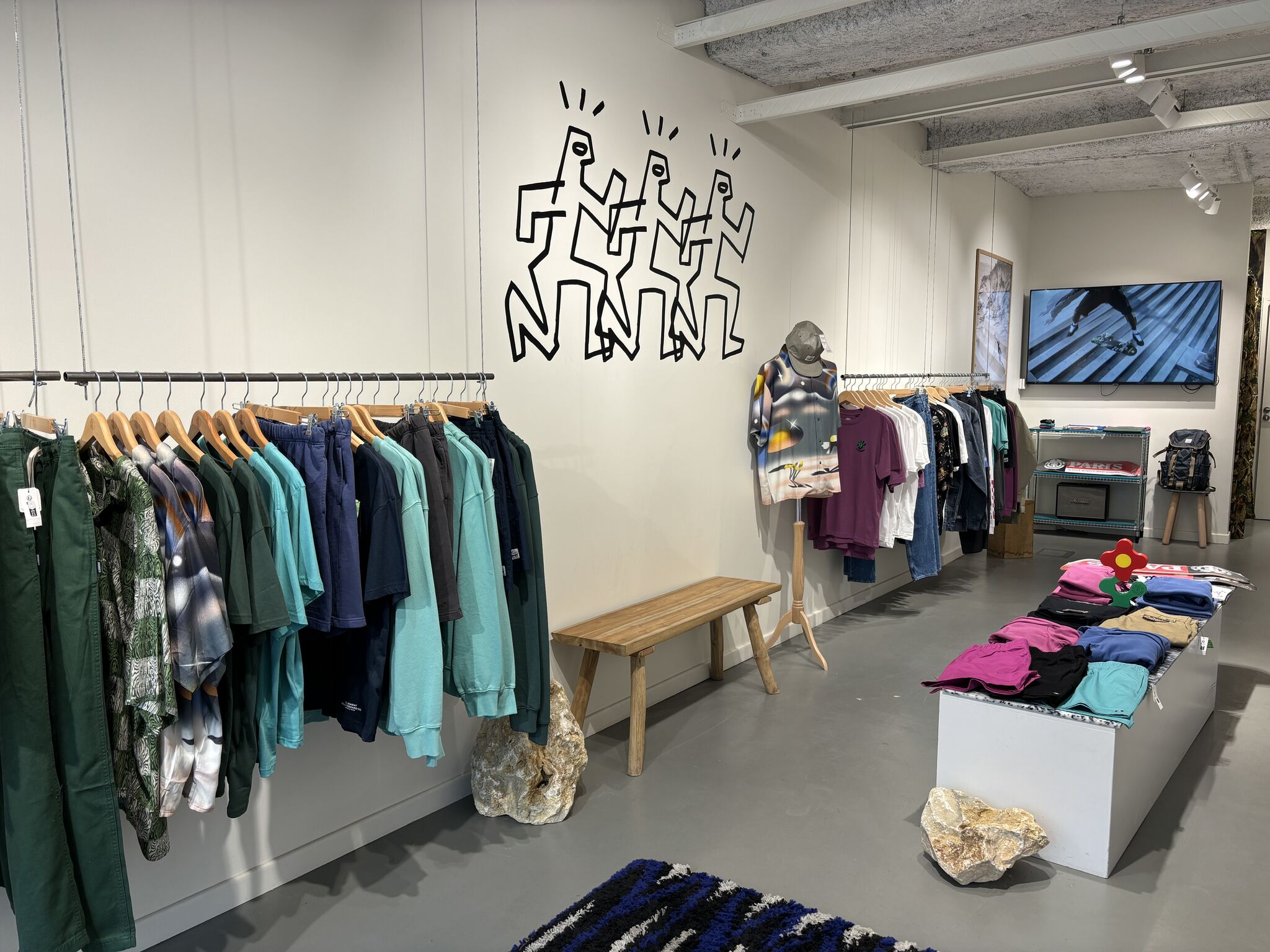
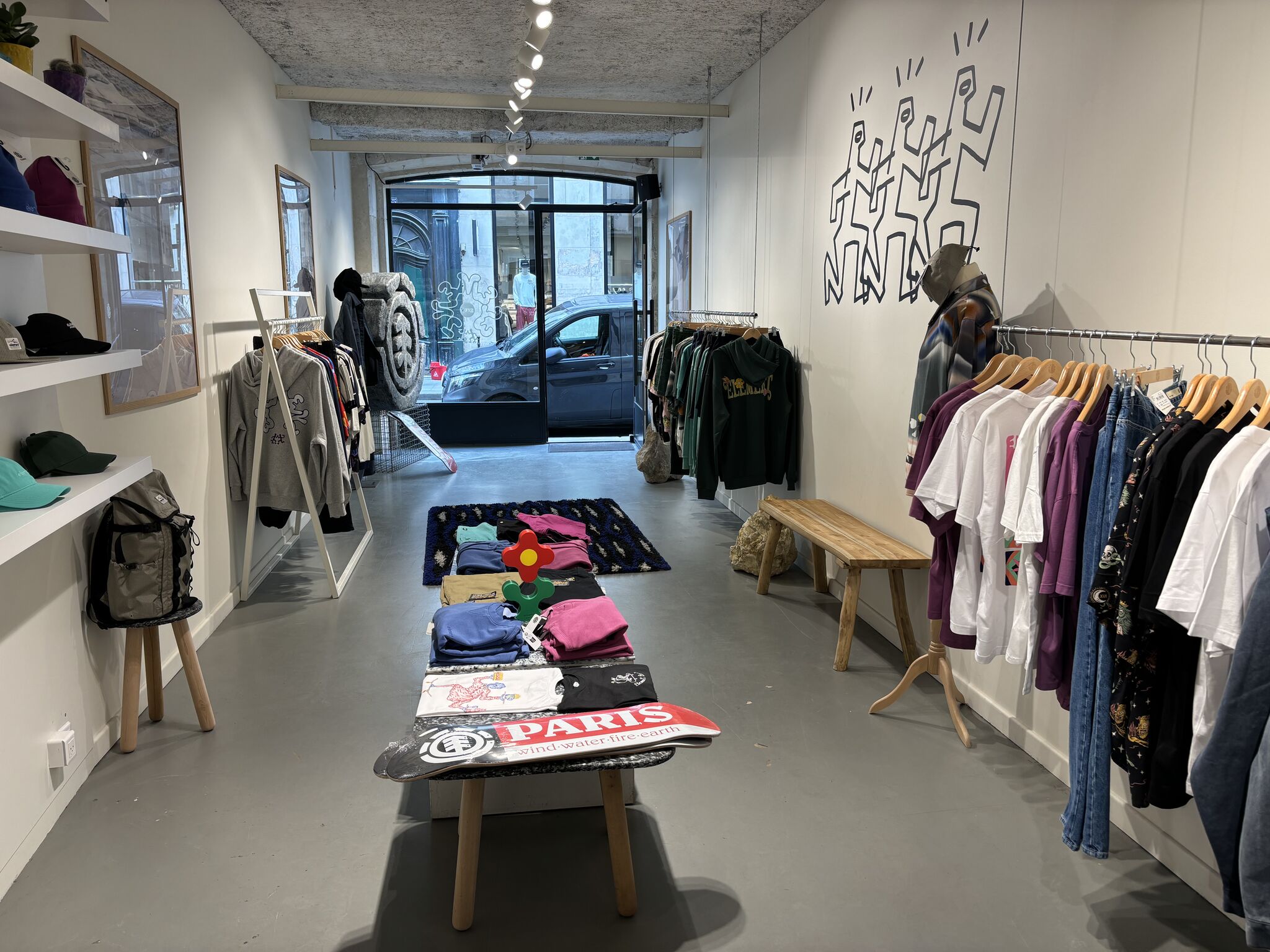
Personally, I quite enjoyed the current design which felt reminiscent of an art gallery: pure white walls, large B&W photo prints and of course that beautiful sculpture of the brand logo!
The product displays and VM, though quite simple, are efficient, putting the product to the forefront, while also integrating a much appreciated local touch with references to Paris.
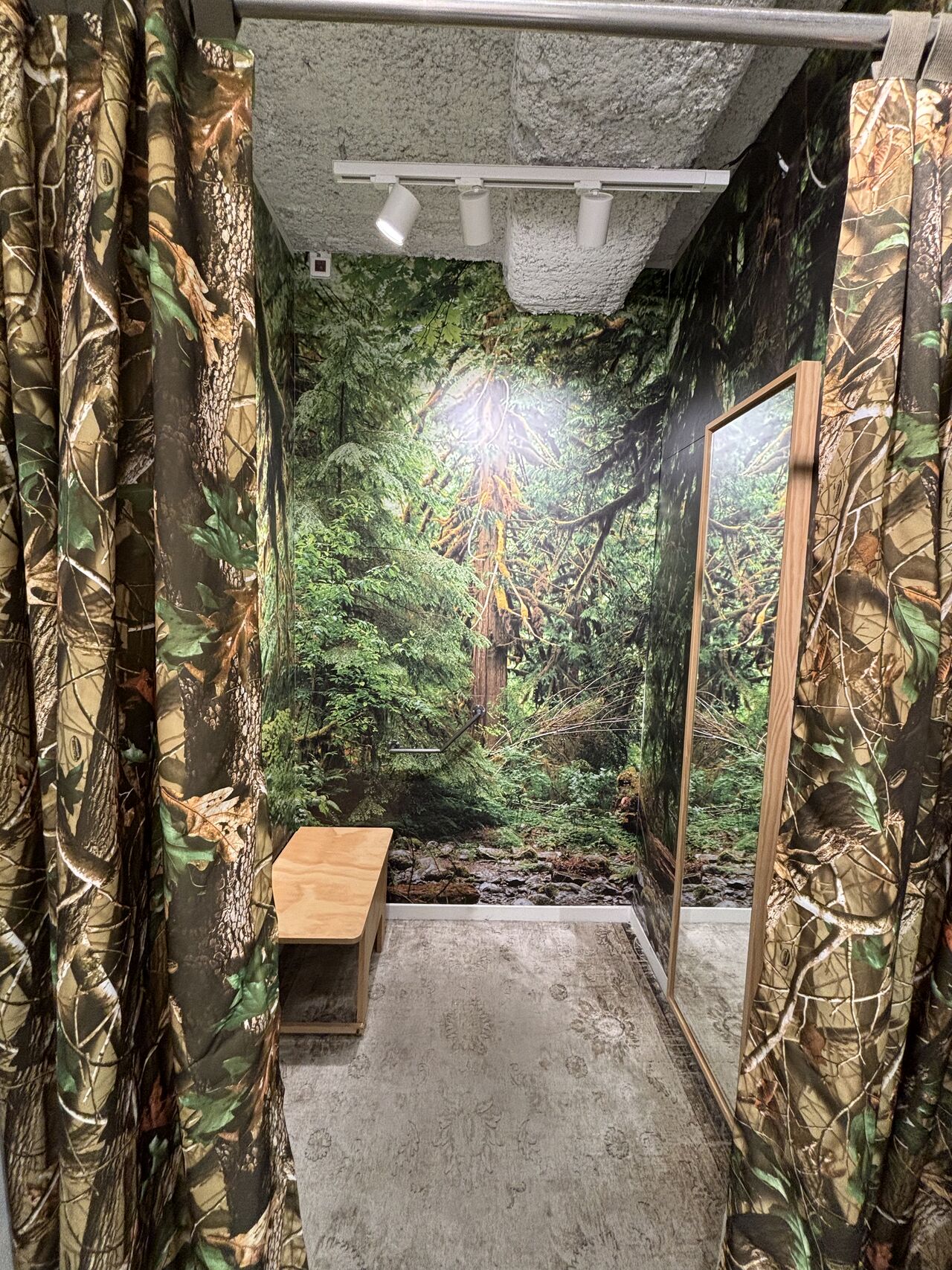
The shop assistant had fun showing me the fitting room: a treatment retained from a previous version of the store design but which the team felt could still bring that bit of surprise and fun in the current scheme.
Overall, for me, this stands as an example of a retail experience which is efficient, brand/ target customer relevant but also has a certain level of memorability… while not going overboard, or over budget. If I had to summarise this store experience, I would say: small and relatively simple but well executed and very much on point!
There is one small possible improvement I foresee and this relates to the limited presence of the brand name and logo. We discussed with the sales assistant that the store is aimed at brand fans who can recognise the logo on its own. This one currently appears on a flag sign, as a small sticker on the door and of course in that striking sculpture I mentioned earlier. Though I understand his point, I would argue that both the flag sign and sculpture are seen almost only from the same position. Someone facing the store from across the street has limited view on both. Additionally, once the customer has passed the logo sculpture there are no more branded elements around. So for me, a relatively small improvement would be to add the brand name either alone or with the logo on the back wall above the screen showcasing skater tricks. This would make the link between the brand and its community that much stronger. Funny enough, this store is located across the stress from Carhartt, a store I WAS looking to visit. But because of its novelty (to me) and simple yet impactful design, I now remember this one better.
Want to know more about creating memorability through store design? Get in touch