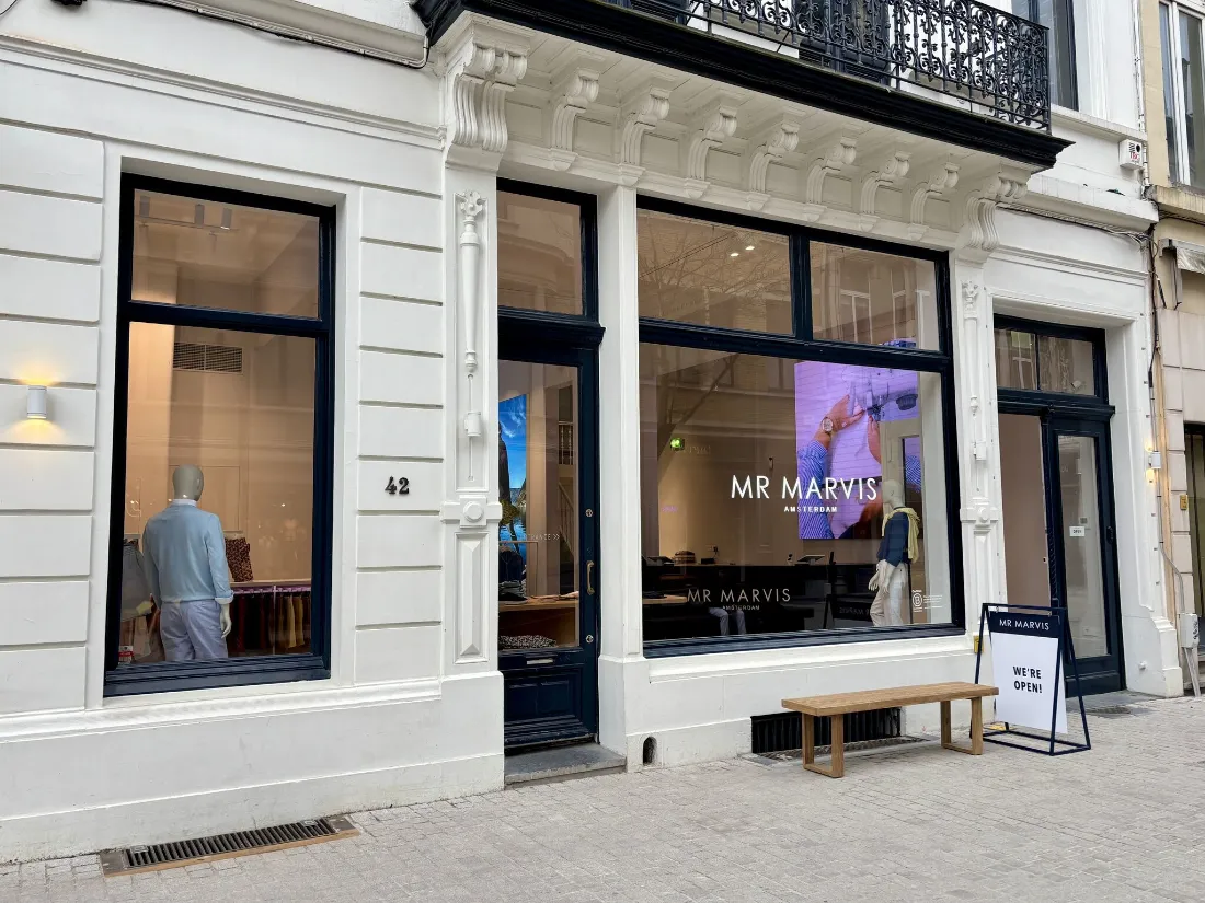
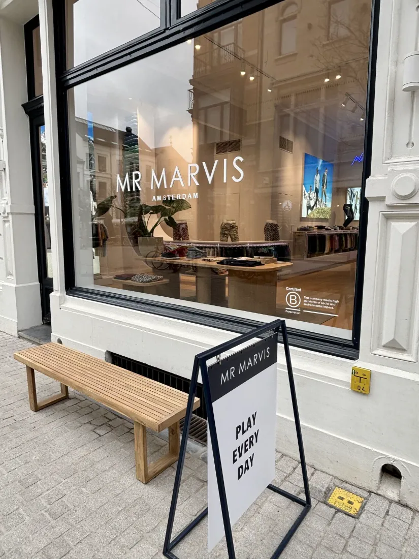
The MR MARVIS store in Antwerp isn’t new, but for me still deserves to be highlighted.
Three reasons why:
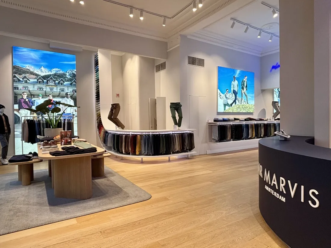
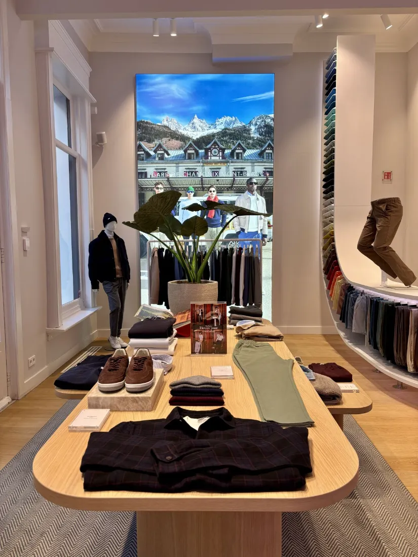
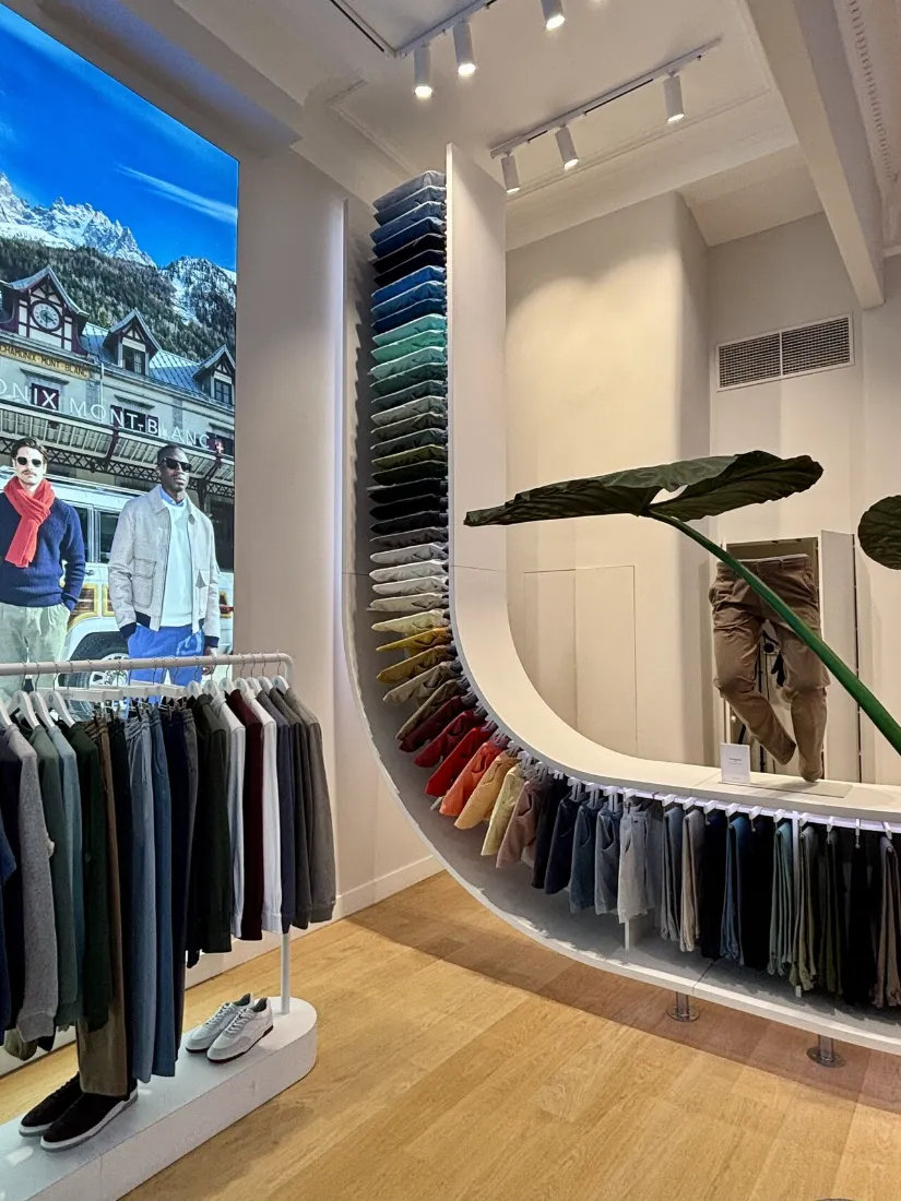
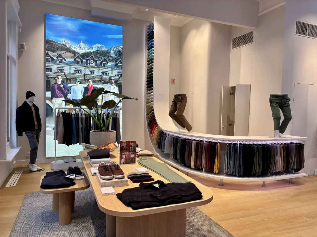
1. The carefully crafted concept
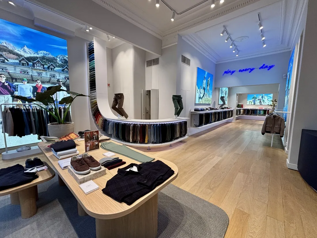
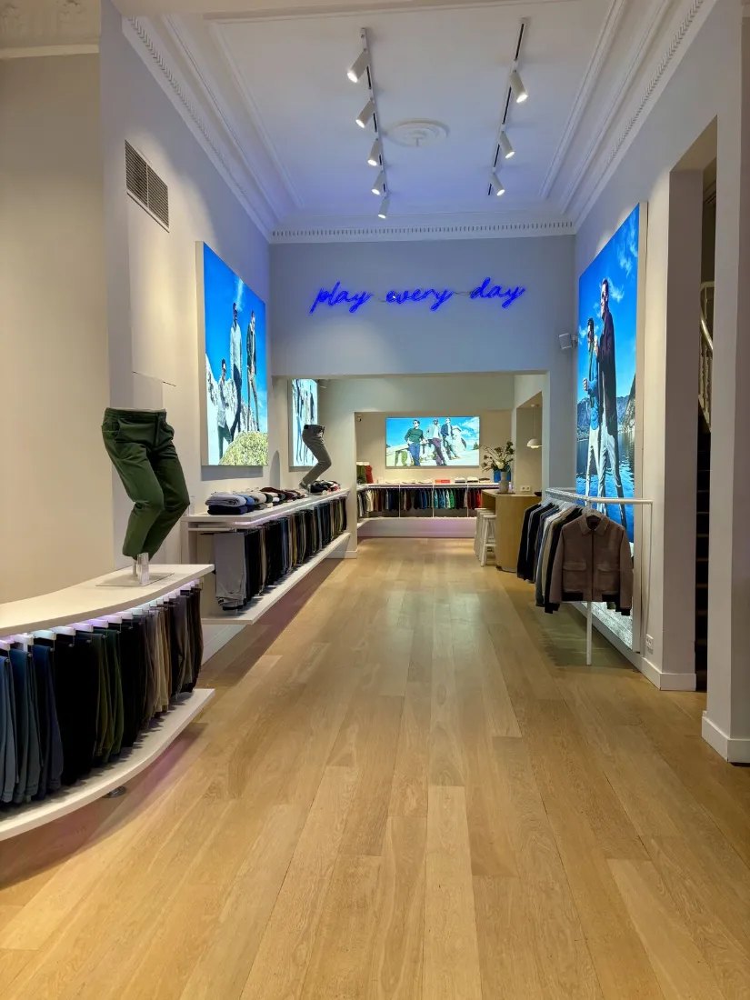
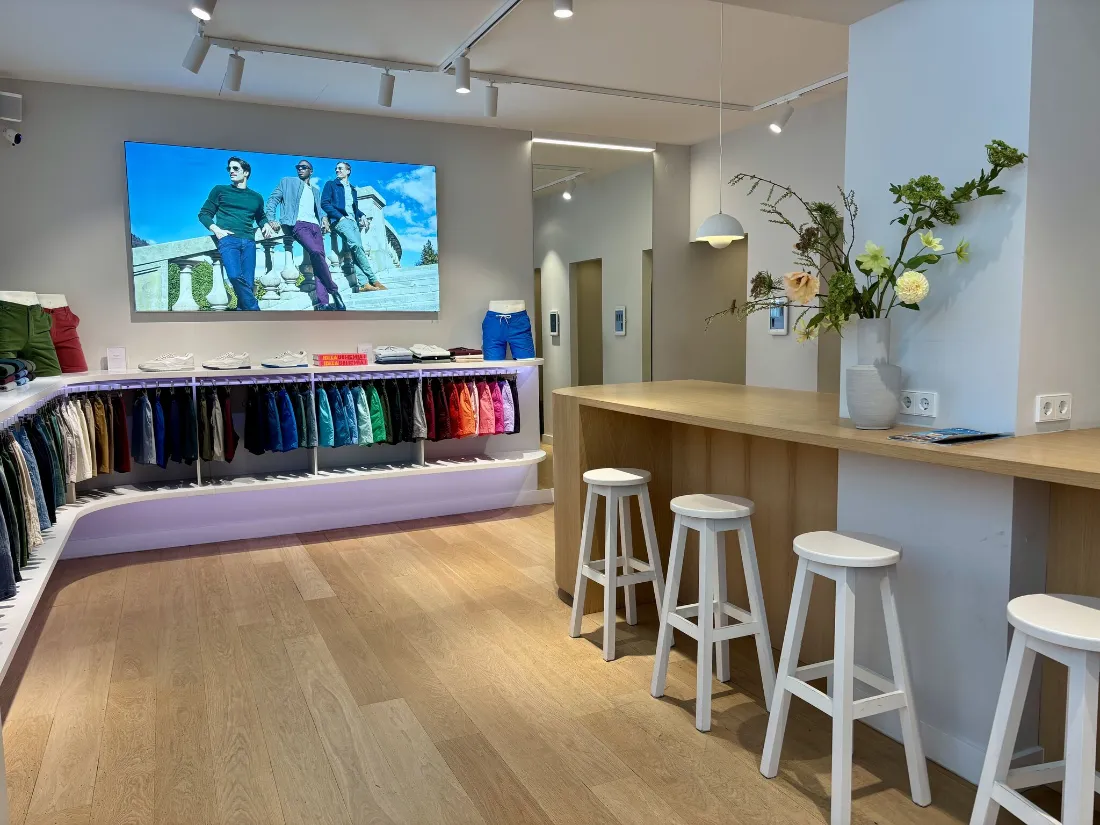
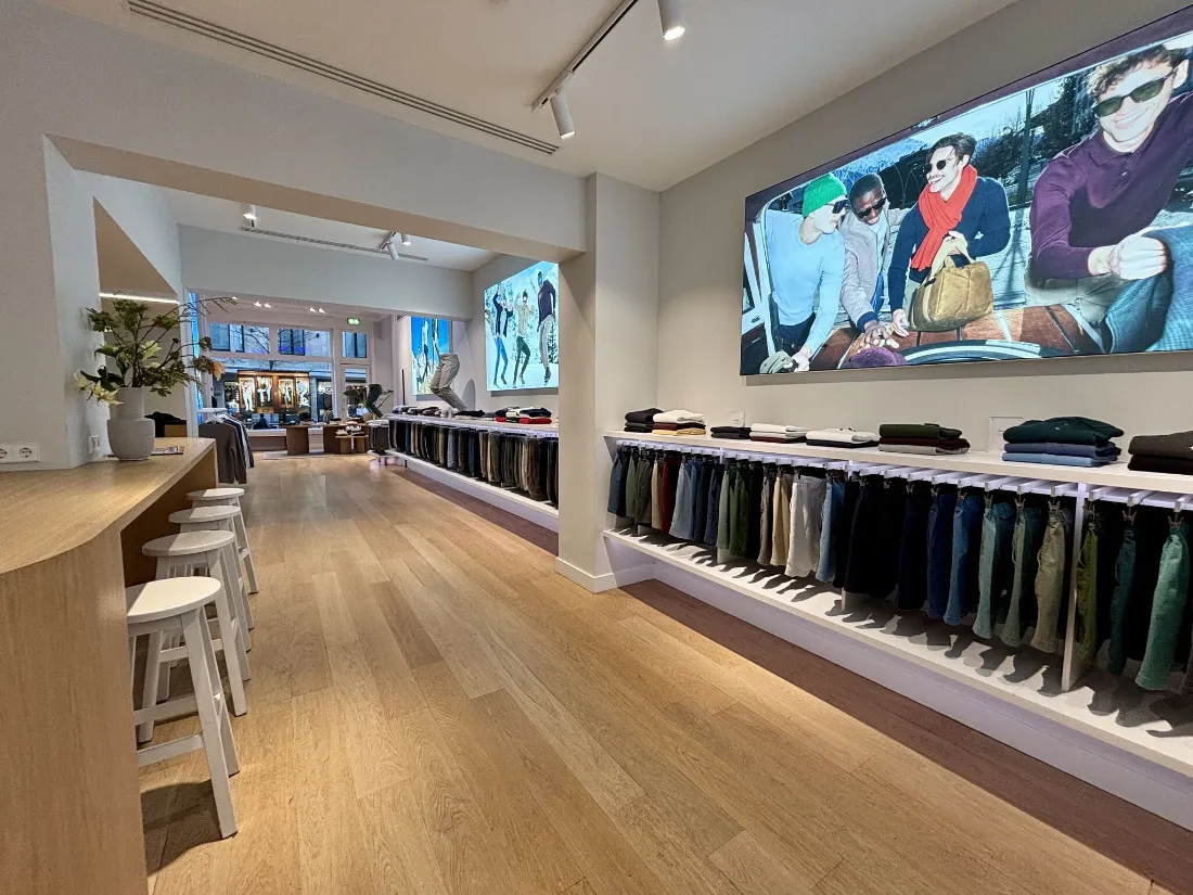
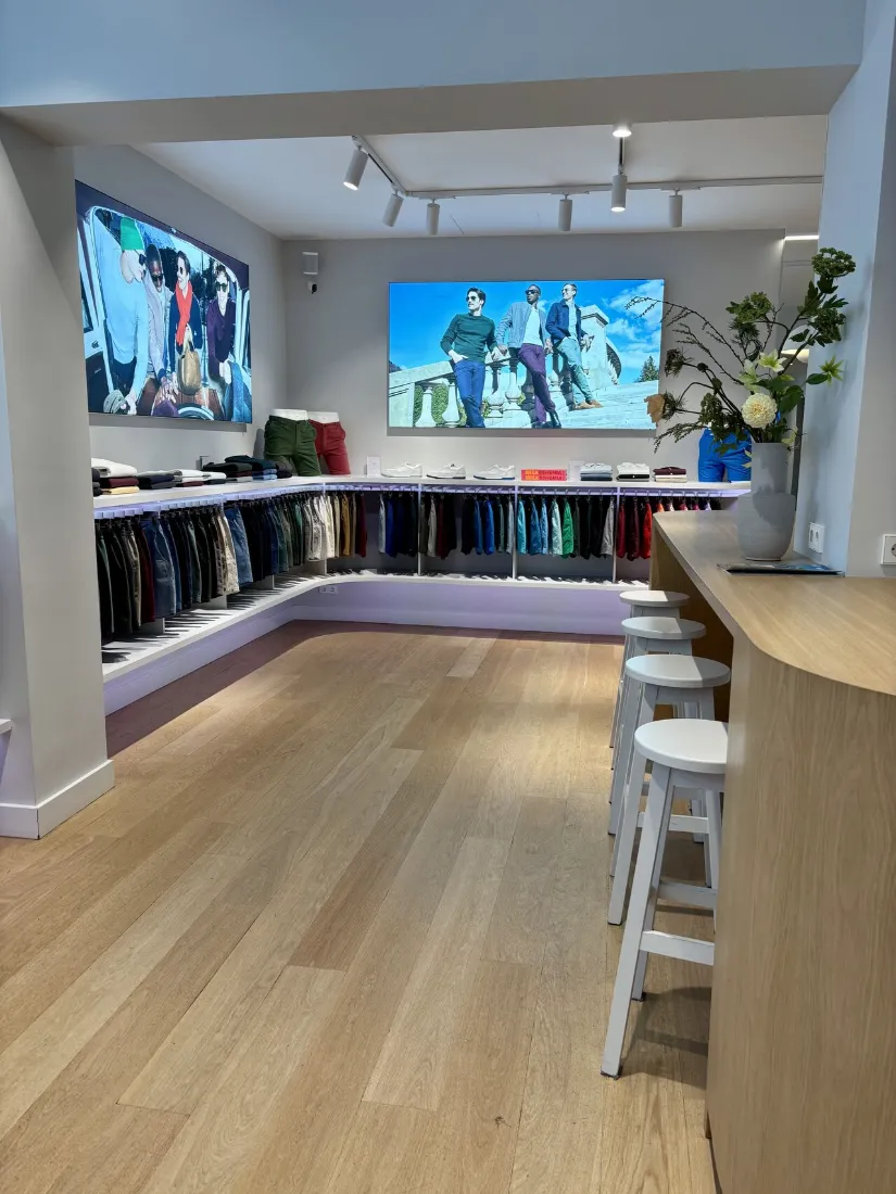
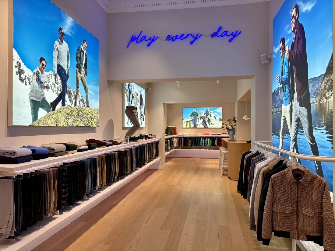
It may perhaps appear to be « just » a well dressed white box, but if you look closer you’ll appreciate the calculated detailing. Most striking is the hanging rack unit which begins as an eye-catcher visible from the outside and then runs throughout the entire store. THIS is what the designers clearly wanted customers to focus on: a beautifully unique way to present products, while also inducing their journey all the way to the fitting rooms. It is apparent the entire store has been conceptualised to support and highlight this element, which for me truly is a brilliant move disguised in simple form.
2. Brand relevance
The rather « purist » aesthetic perfectly matches the brand and its products. Indeed Mr. Marvis’ key offer is a range of basic men’s shorts & chinos. Classic, practical, well crafted, with a potential touch of fantasy (through the colour selection). Does this description not match that of the store concept? As a retail design strategist, this store exemplifies the key to good retail design practice: the ability to deliver an aesthetically pleasant store concept, yes, but one that aligns with the brand (identity & offer) and its customers. Not « beauty for the sake of beauty », but aesthetic for the purpose of supporting the brand story.
3. Digital integration
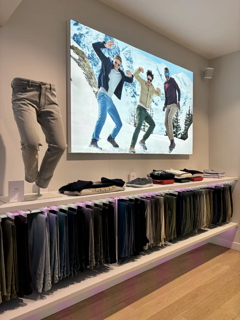
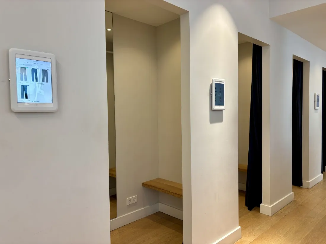
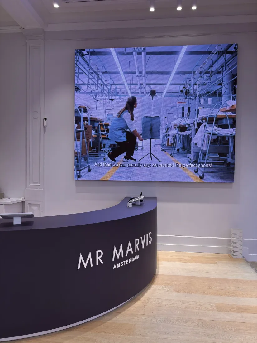
In the same line, I see this store as a great example of in-store tech done right. No « tech for the sake of tech ». Rather, digital elements that have been carefully reflected upon in terms of their purpose and position in the customer journey. I quite like the iPads next to each fitting room offering product information and service support. But I most particularly appreciate the screen close to the cash desk and entrance. It works perfectly well in this location as the animation attracts customers’ attention from outside. However, as the screen is in fact parallel to their journey, they aren’t distracted by its content as they enter because the store itself takes over. The content becomes more apparent towards the end of the journey, most notably as customers wait to pay. The actual content is also worth praising: a short video of the product manufacturing, providing a better appreciation of the craftsmanship at the core of the brand identity.
Truly, for me, this Mr. Marvis store represents a great example of physical retailing done right. Why? Because it was crafted around the brand’s identity, with each individual store element purposefully integrated to deliver a holistically coherent branded customer touchpoint.
Would you like to discuss how to craft such an “on-brand” in-store experience for your next store opening? Get in touch.