The hippest concept store in Brussels right now is undeniably MAYFAIR BXL. Granted it’s been open for more than a year and so isn’t the “newest”, but it remains the one “WOW” store you will not want to miss when visiting!
So what makes it so special?
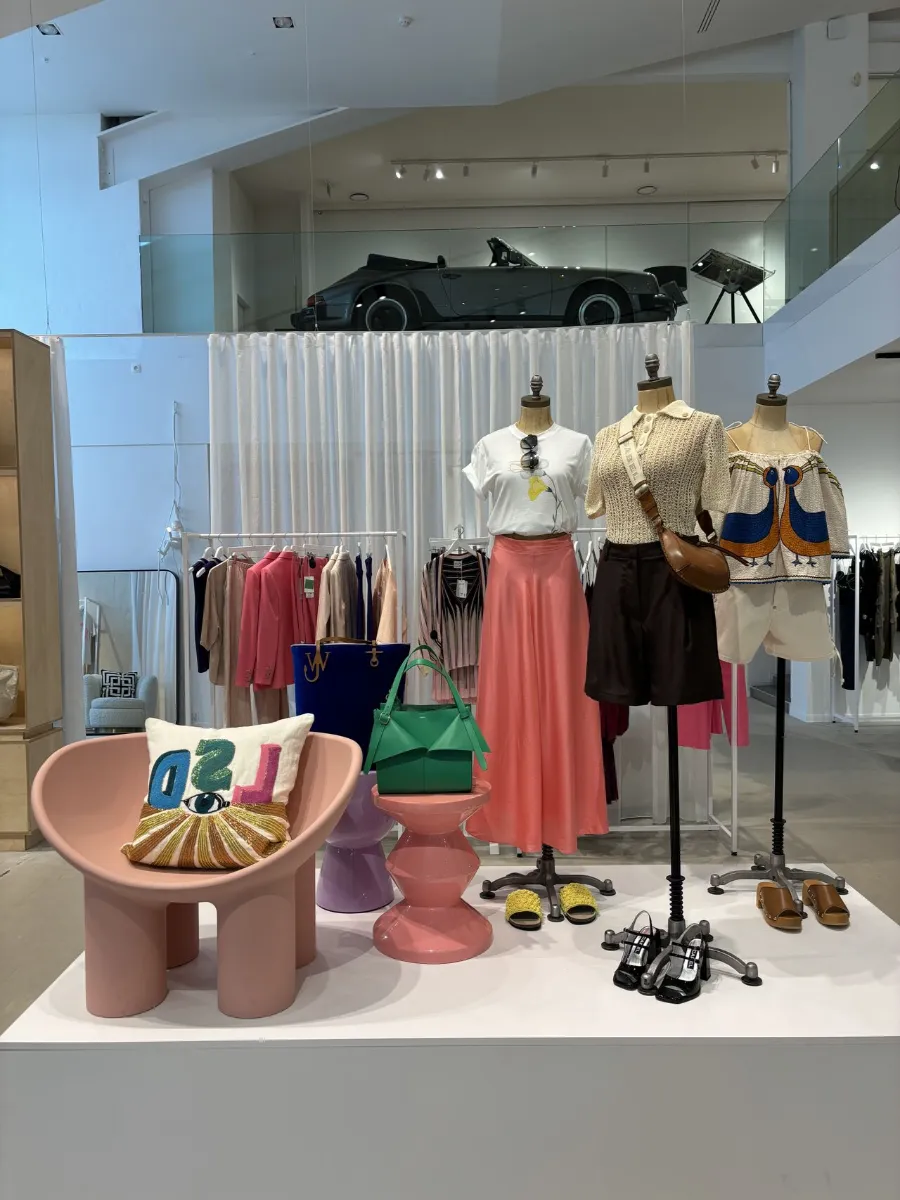
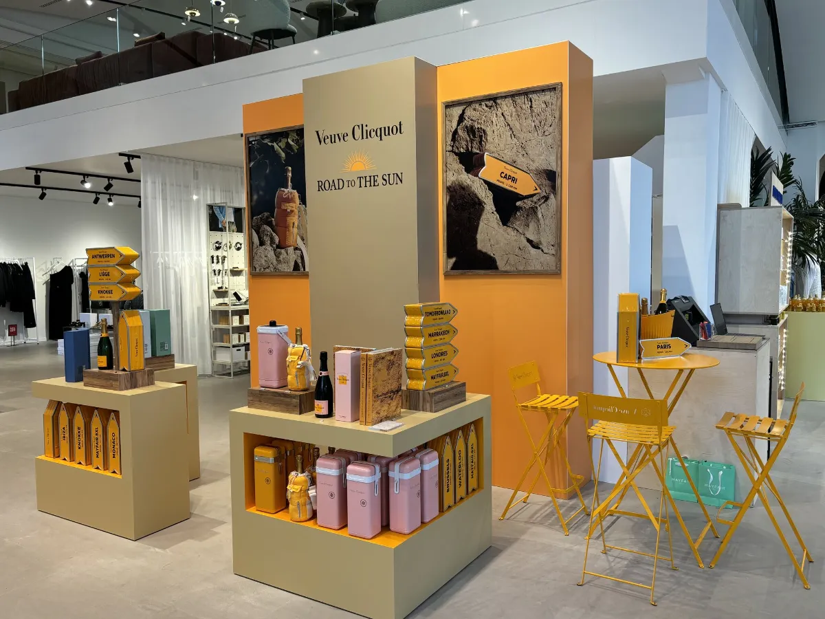
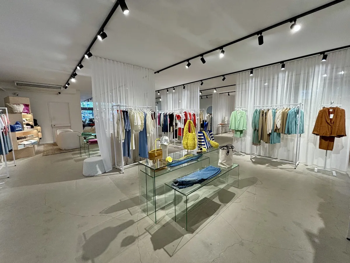
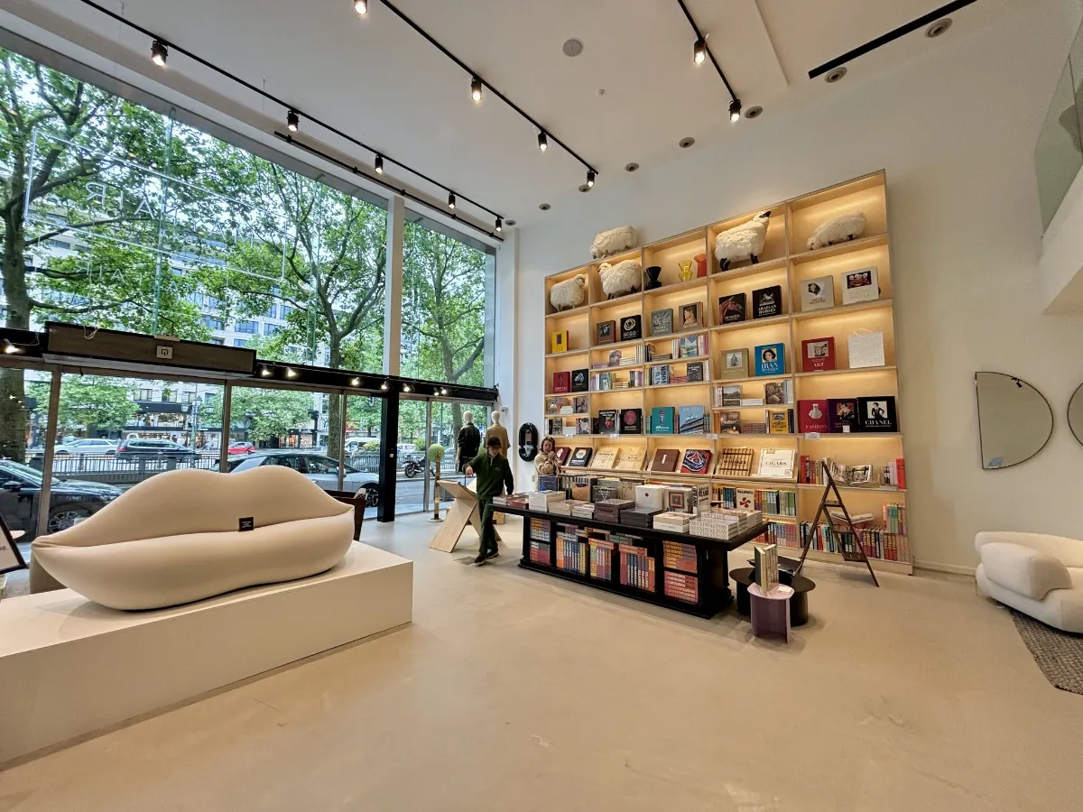
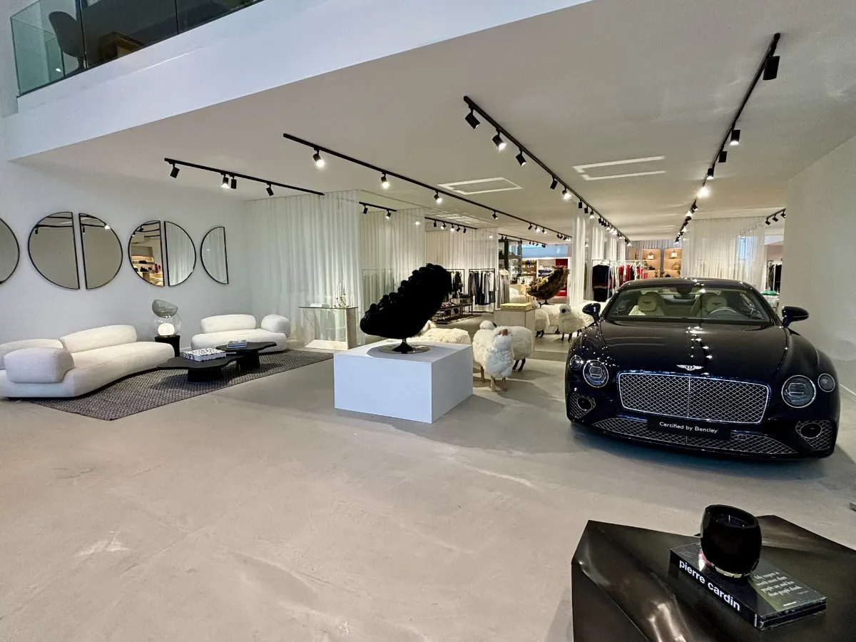
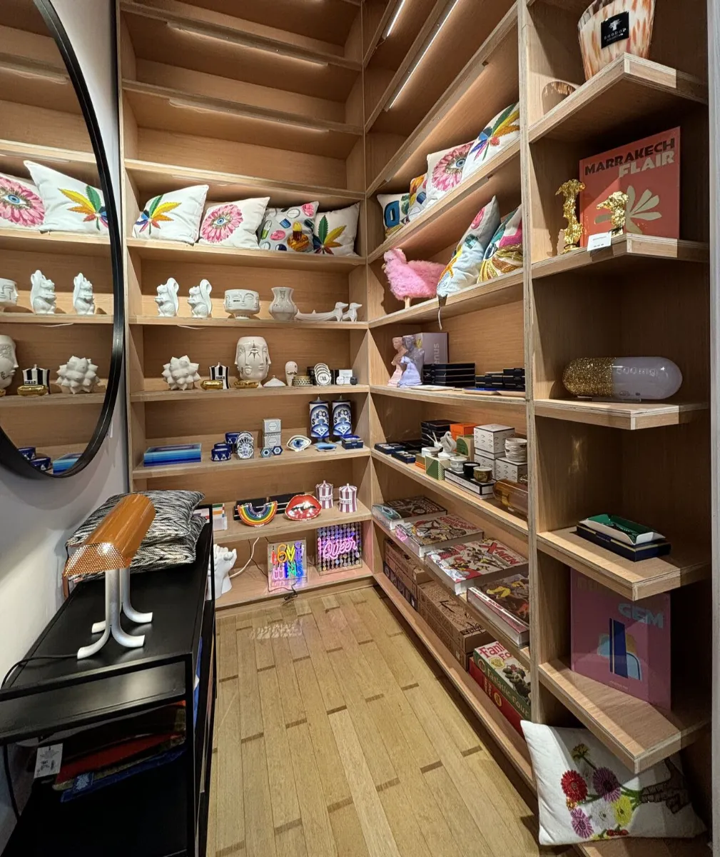
Though not design specific, the most striking aspect of this store for me is its offer! Have you ever seen a pair of 15€ sushi socks sitting casually next to a Bentley? Yet here it all feels totally natural. Luxury fashion, decoration, furniture, books and more are all beautifully mixed with more affordable pieces. And this, to me, is pure genius as it actually makes luxury feel accessible!
Of course as a retail designer my main focus remains how MAYFAIR BXL has managed its store design. And here I must say there is much to praise:
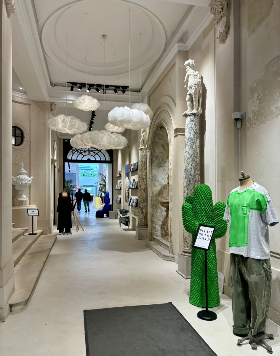
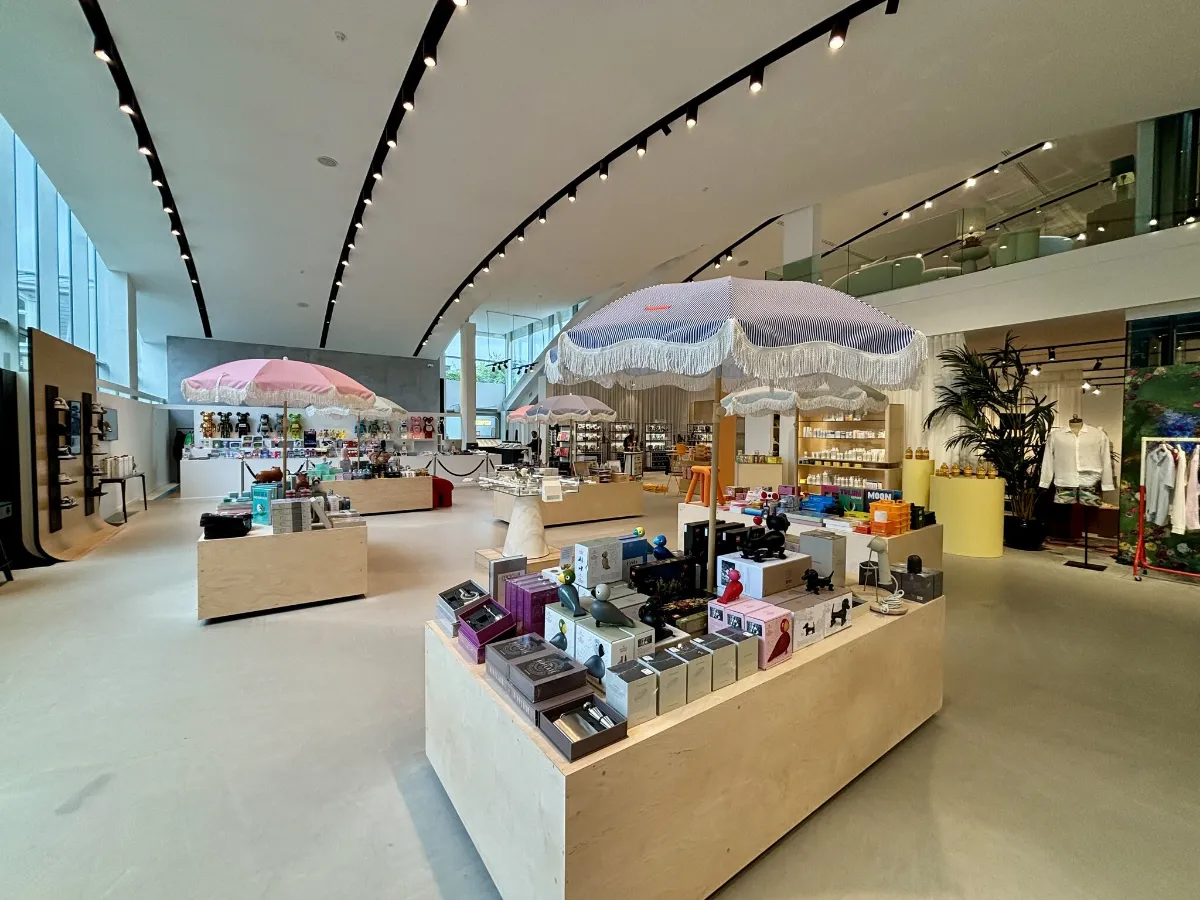
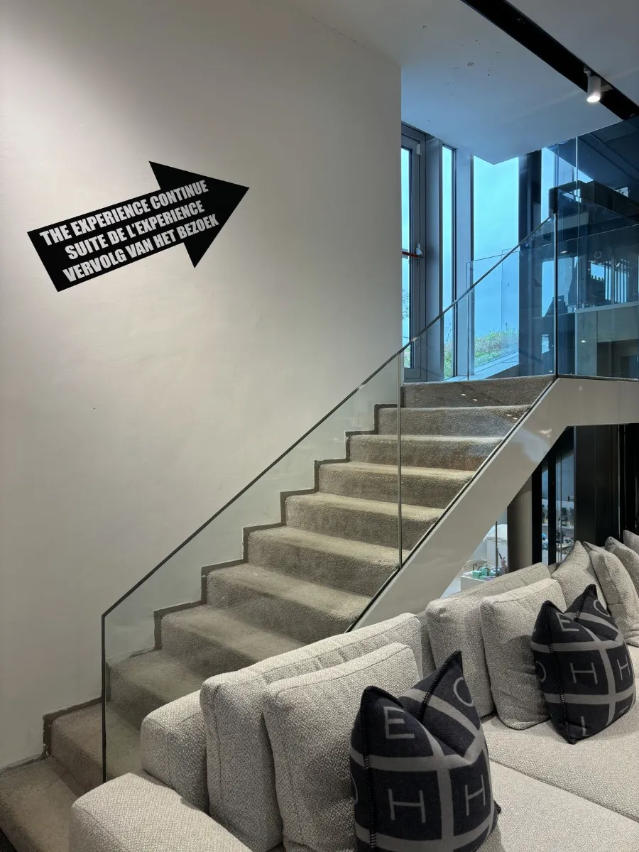
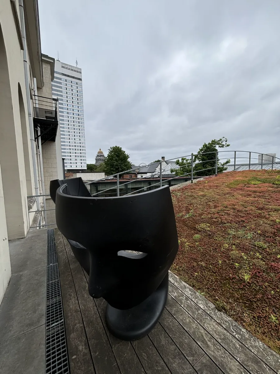
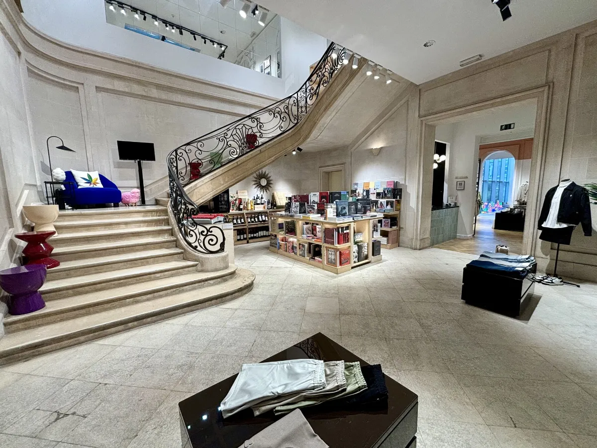
An amazingly smooth store flow creating a seamless journey of discovery. Multiple buildings with different architectural styles have been combined, yet the flow leads customers from one to the other without them noticing. It starts with a classic porch passage bringing customers to a huge modern vaulted ceiling room. There the displays naturally guide them through 2 floors of a more modern building. Upstairs, a well located sign invites them to follow their experience up a set of steps and onto… a rooftop green space complete with a view of the Brussels skyline! A door then leads them back inside the more classical building where they are naturally led to a grand staircase and back to the porch space.
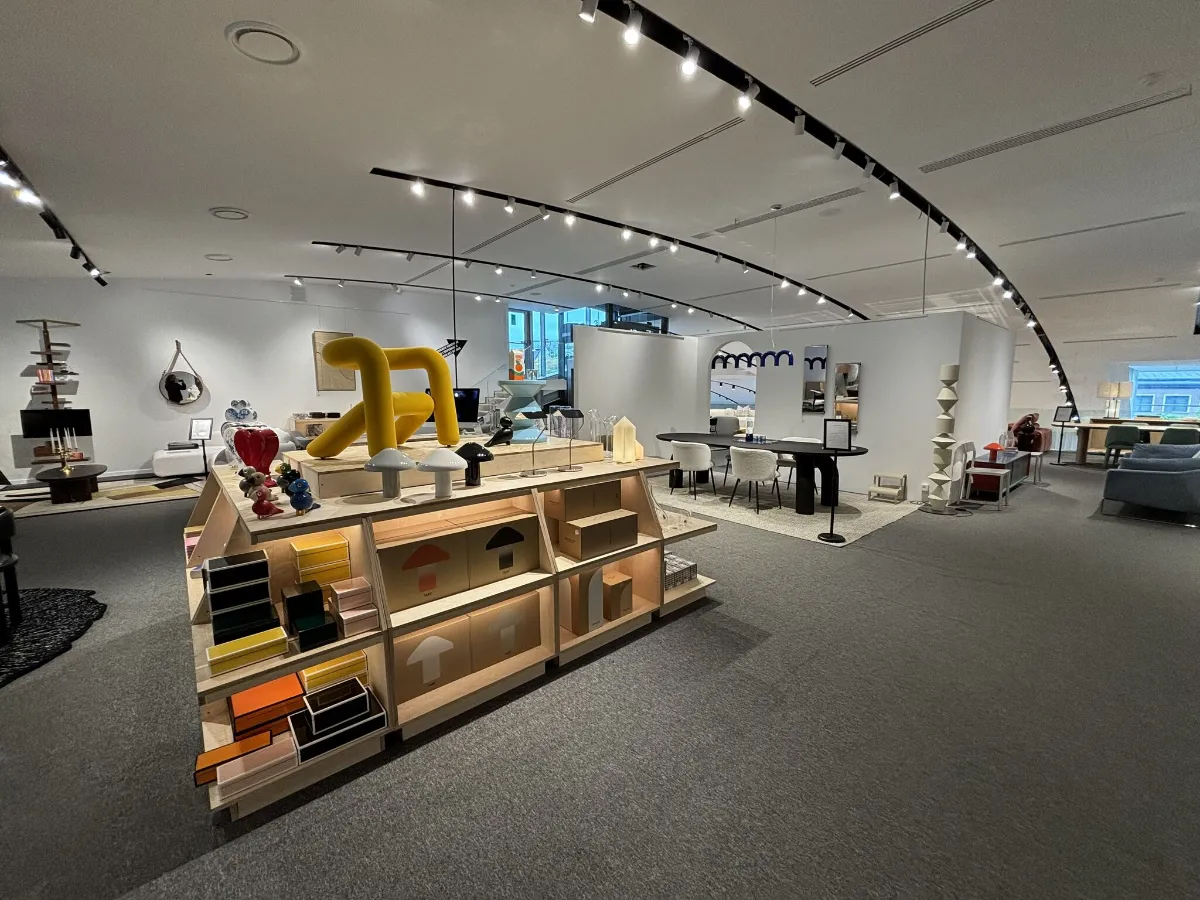
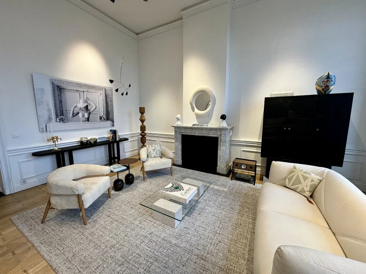
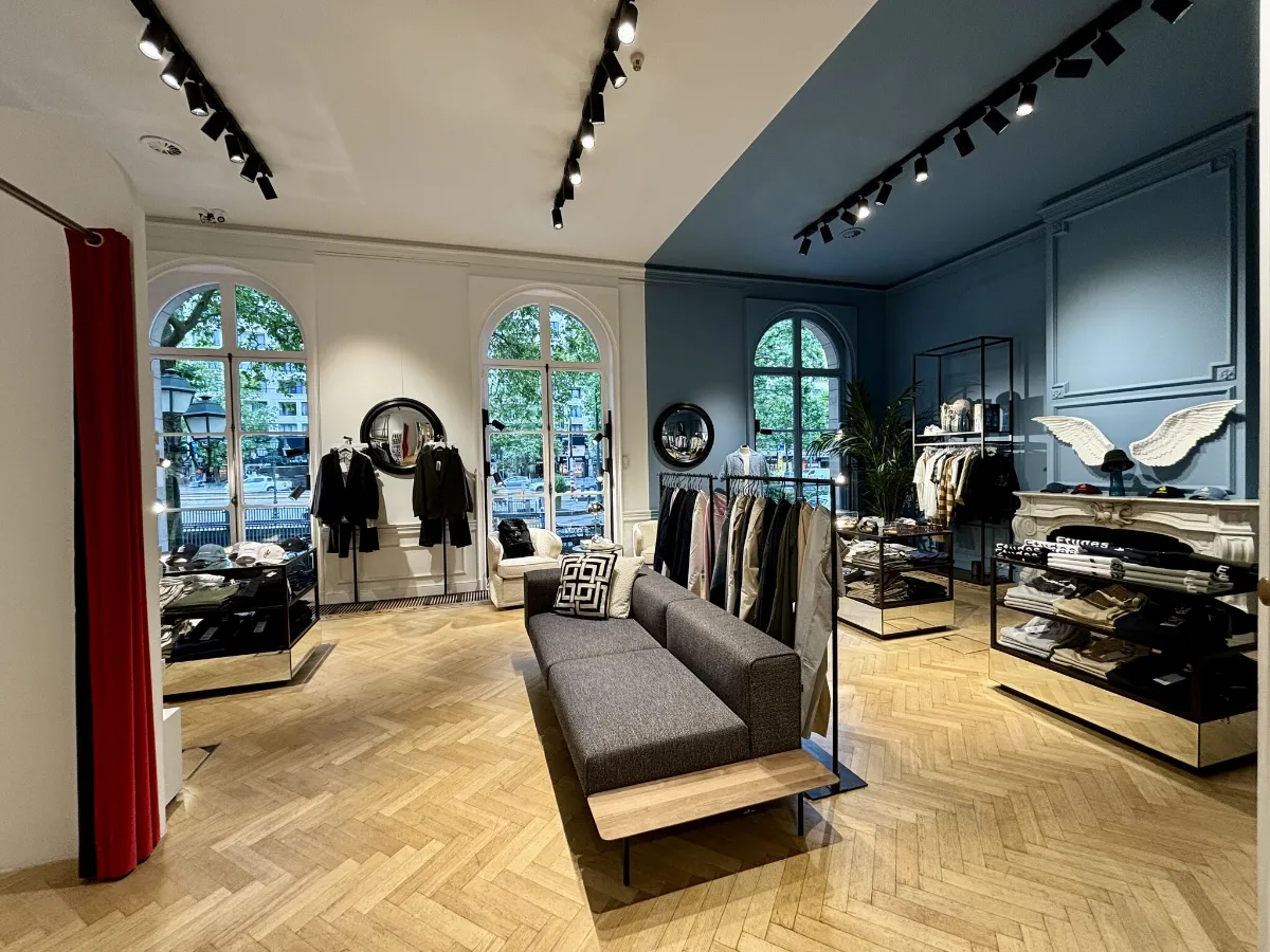
Designated product areas subtly separated, bringing the massive store back to human scale.
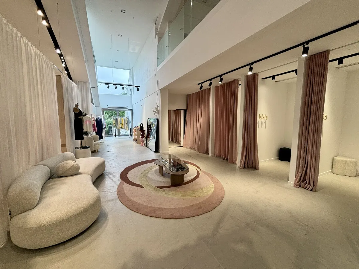
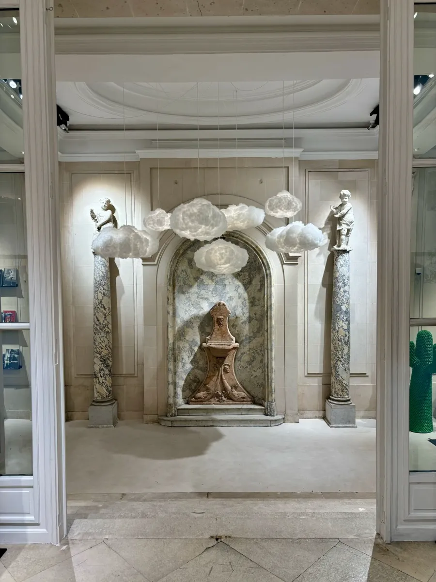
An overall look & feel which is light, open, welcoming and fun. Eye catching pieces are cleverly placed to lead customers in their flow and create that perfect instagram photo moment which will anchor the experience in their minds.
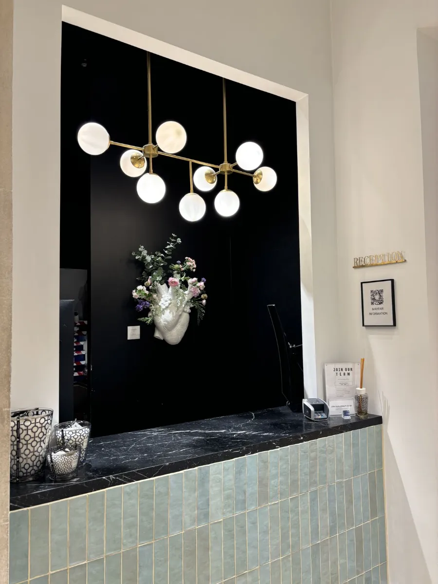
A selection of finishes translating the positioning & allowing products to stand out.
Exceptional VM.
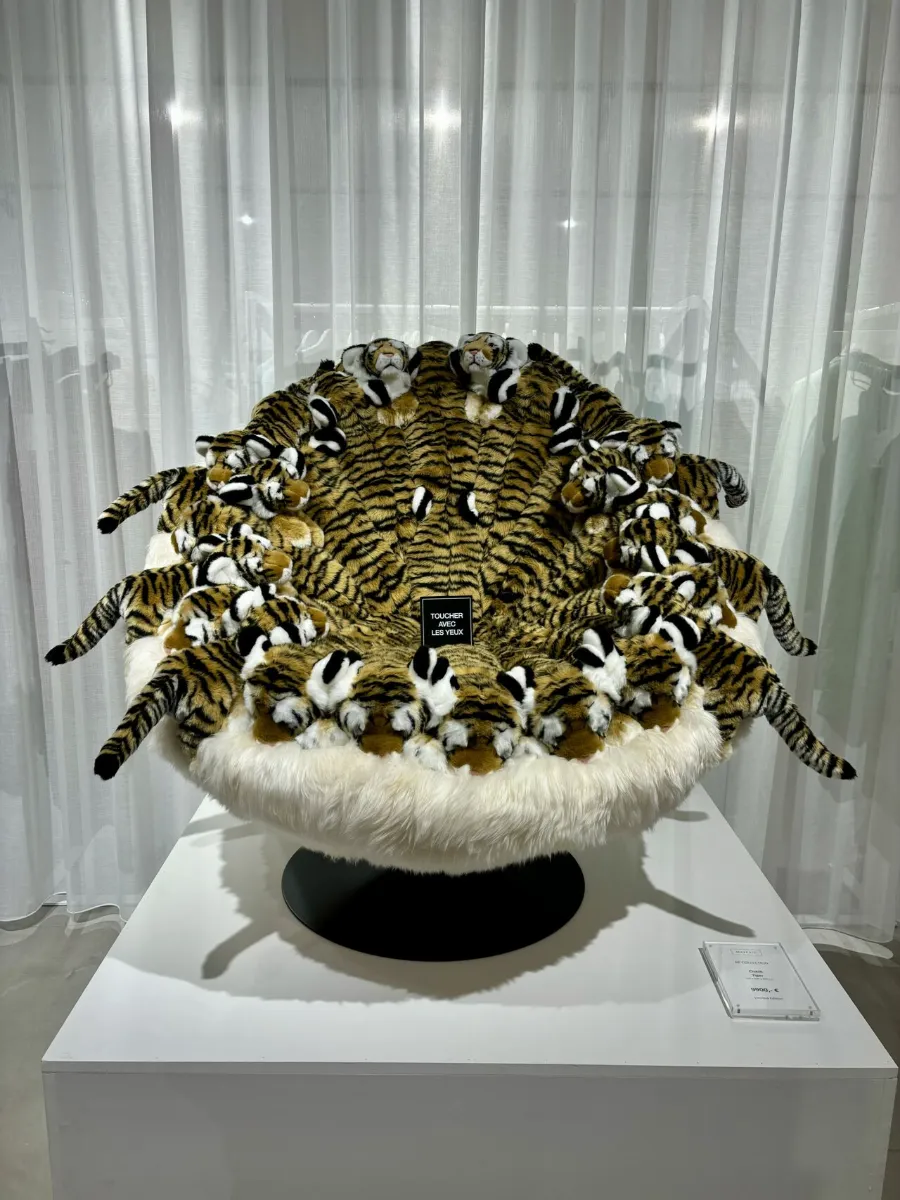
What I also love here is how this store invests in creating a new experience at every visit by constantly switching things up. Those teddy chairs are always on the move!
- Truly, there is little I could find to improve. Perhaps just the following:
I find the “do not touch” signs a bit off putting. I understand the need, but could it be managed in a more store relevant way? - Maybe a bit of storytelling? Who is Mayfair? What’s the idea behind it besides this fun mix of products and store design?
- Taking the music volume down. A small thing but I find that after a while I feel overwhelmed by this.
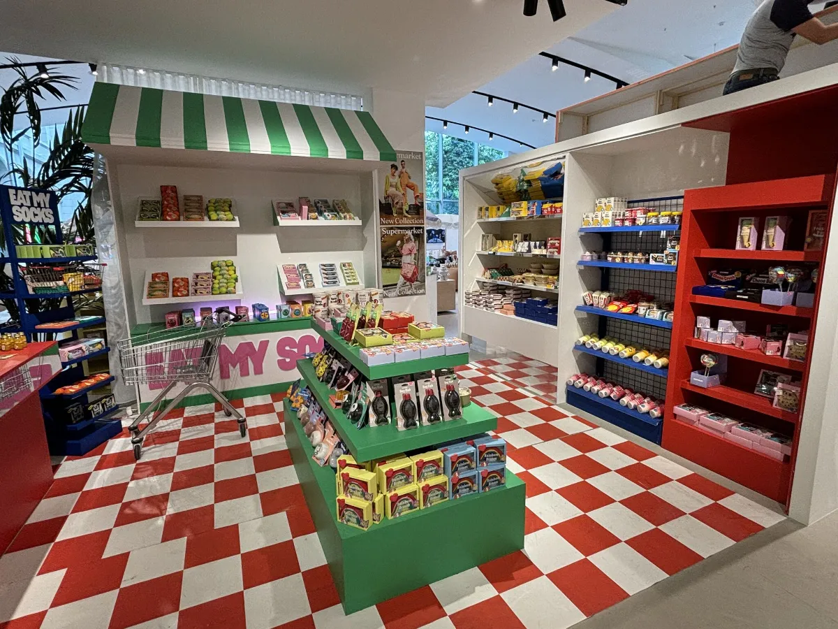
A final note to praise my favourite part of this shop: the “eat my socks” pop up, complete with shopping trolley. Priceless!
What’s YOUR favourite part of this design? And have you ever seen such fun combinations of products before?
Would you be interested to visit this incredible store together as part of a tailored retail tour of Brussels? Let’s discuss! Get in touch.