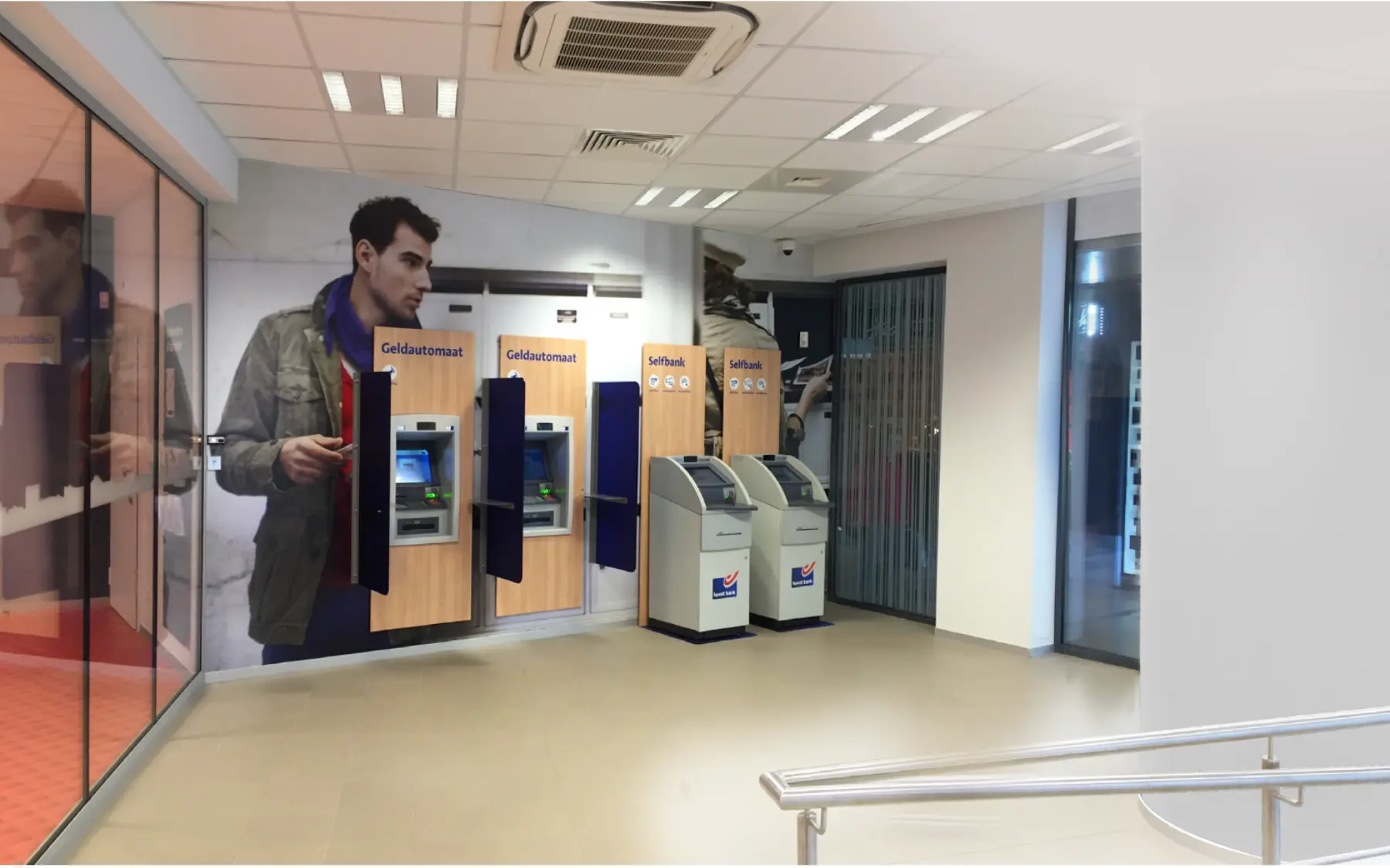
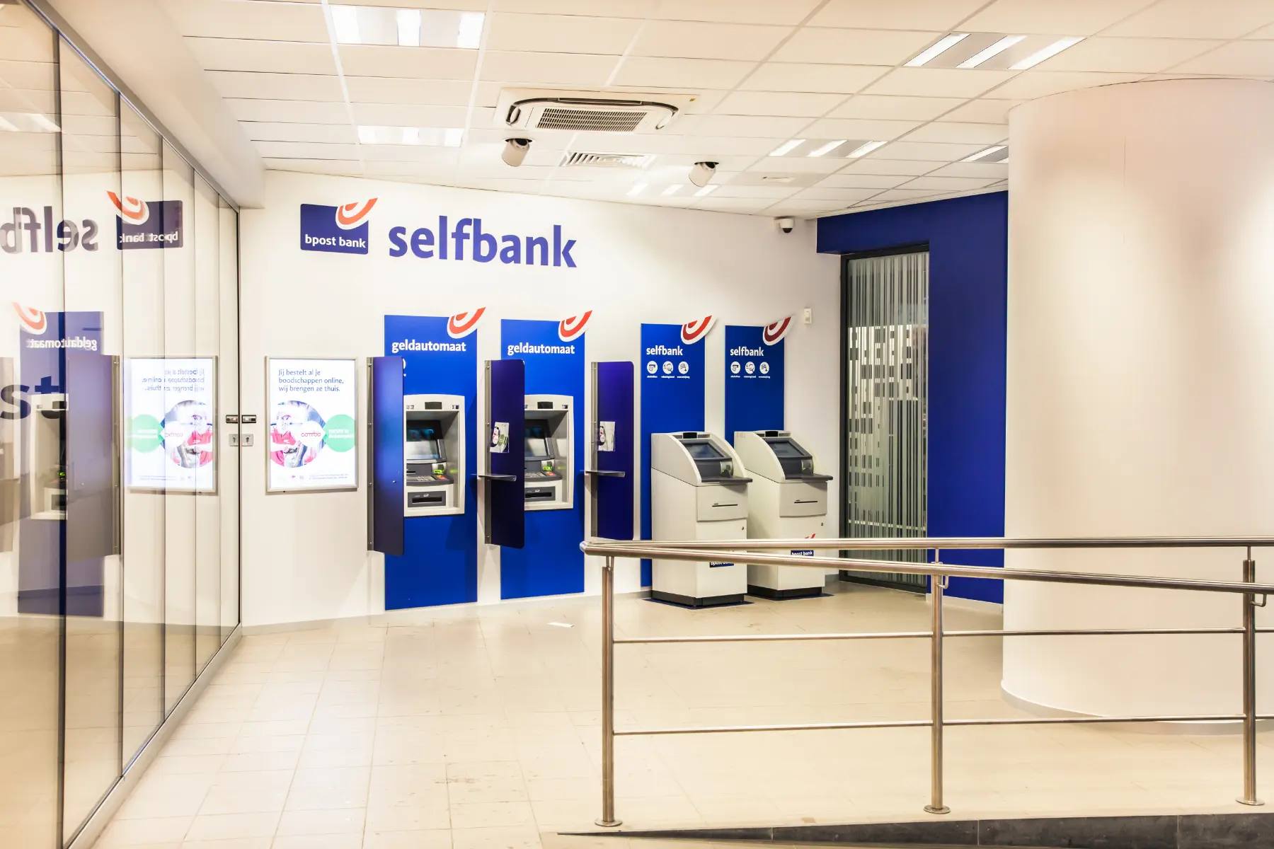
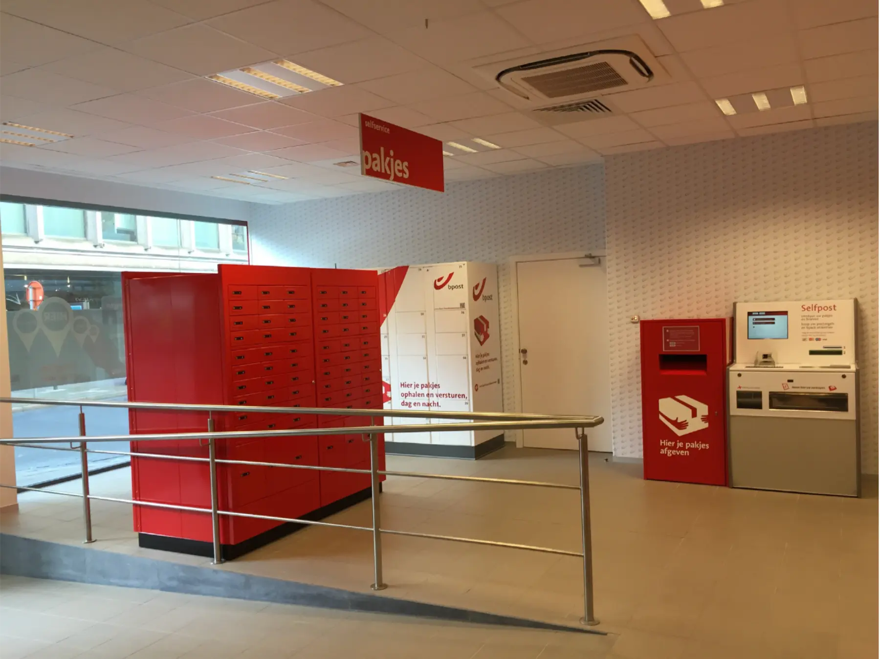
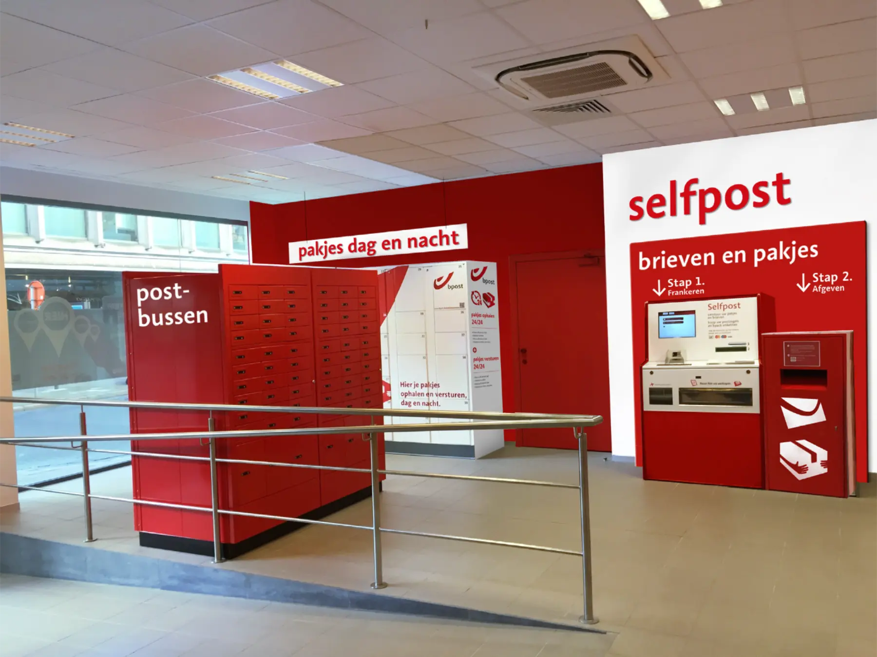
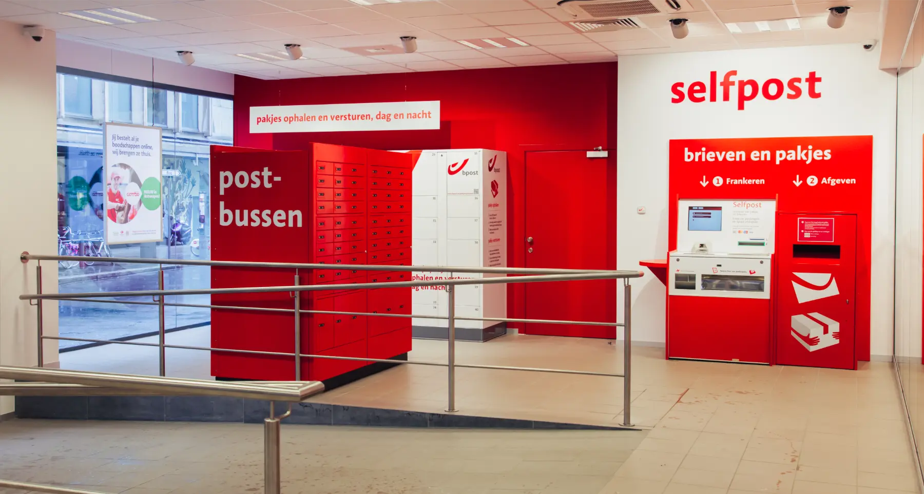
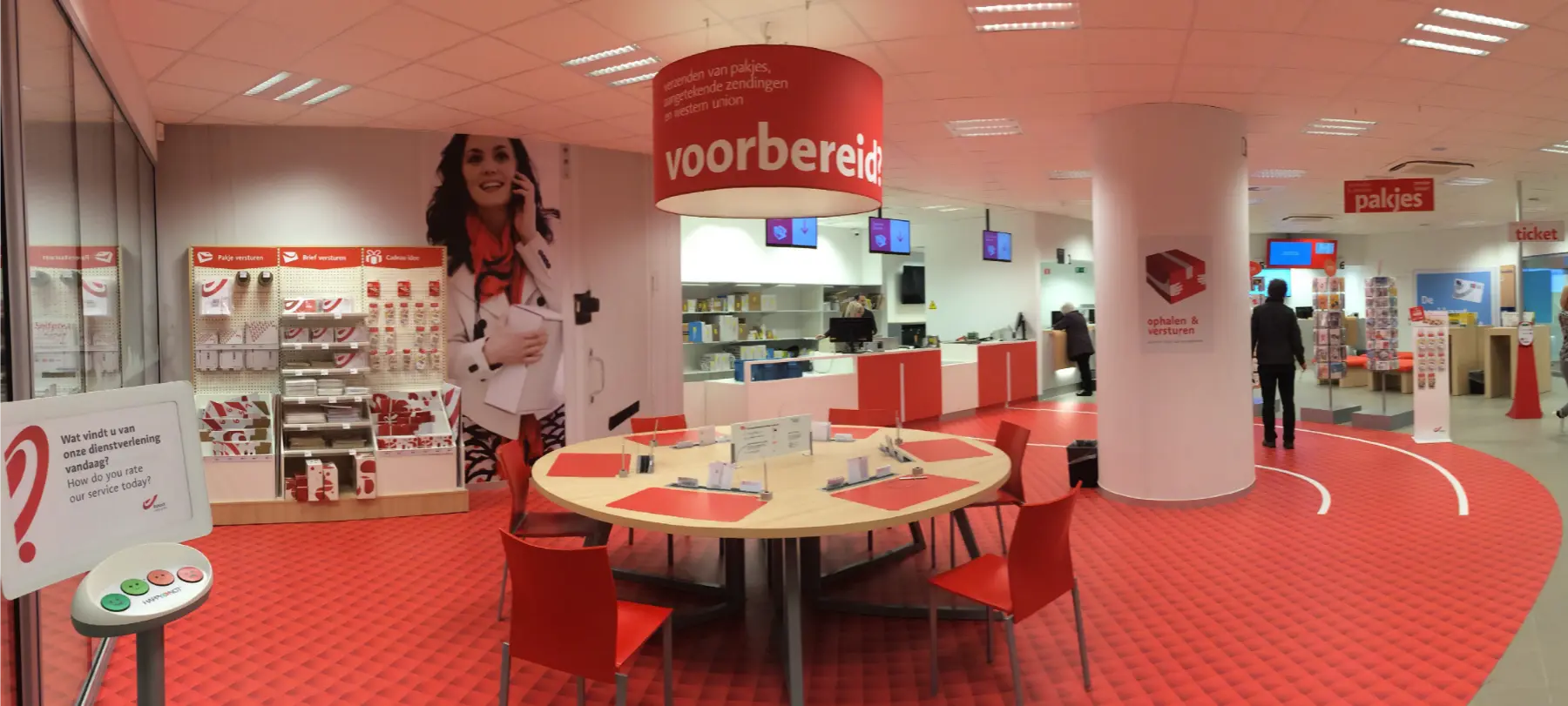
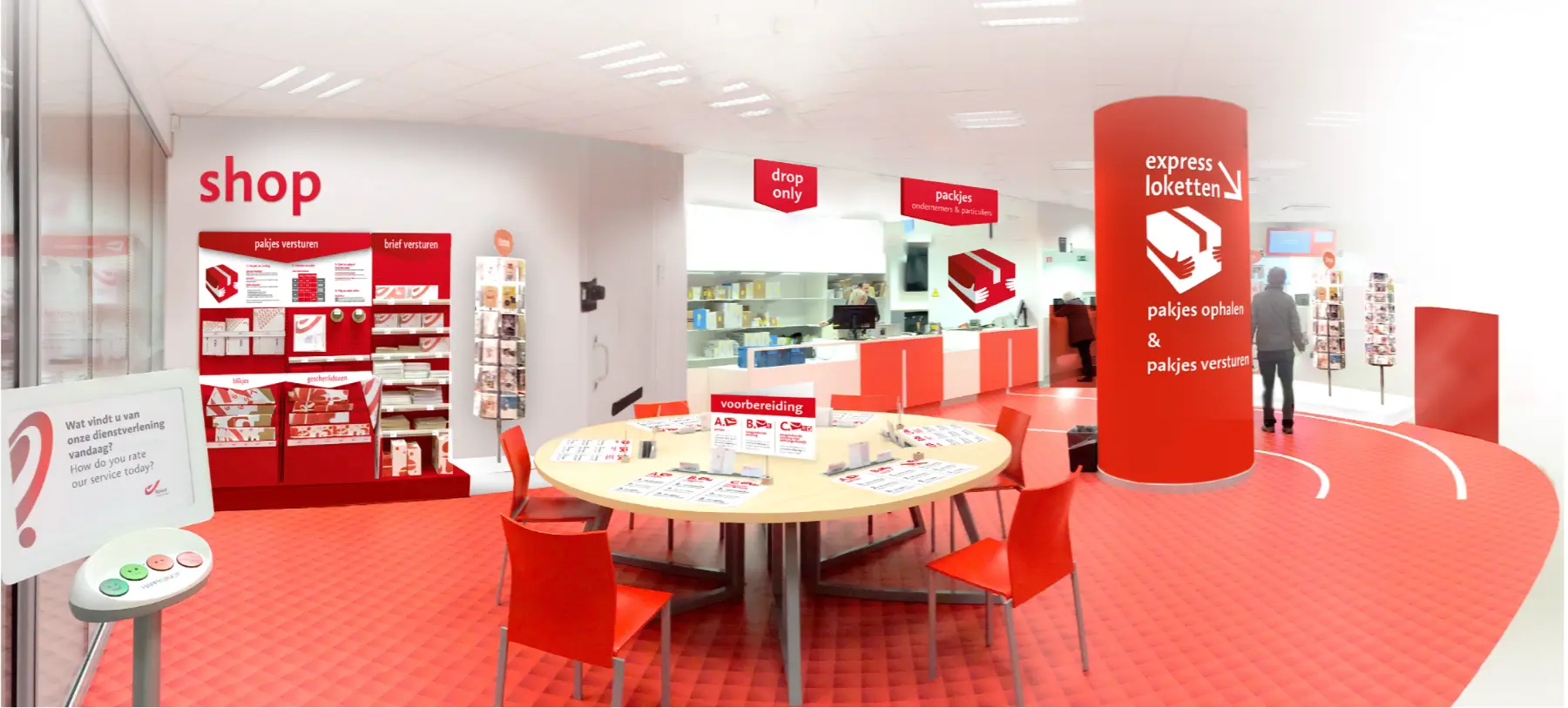
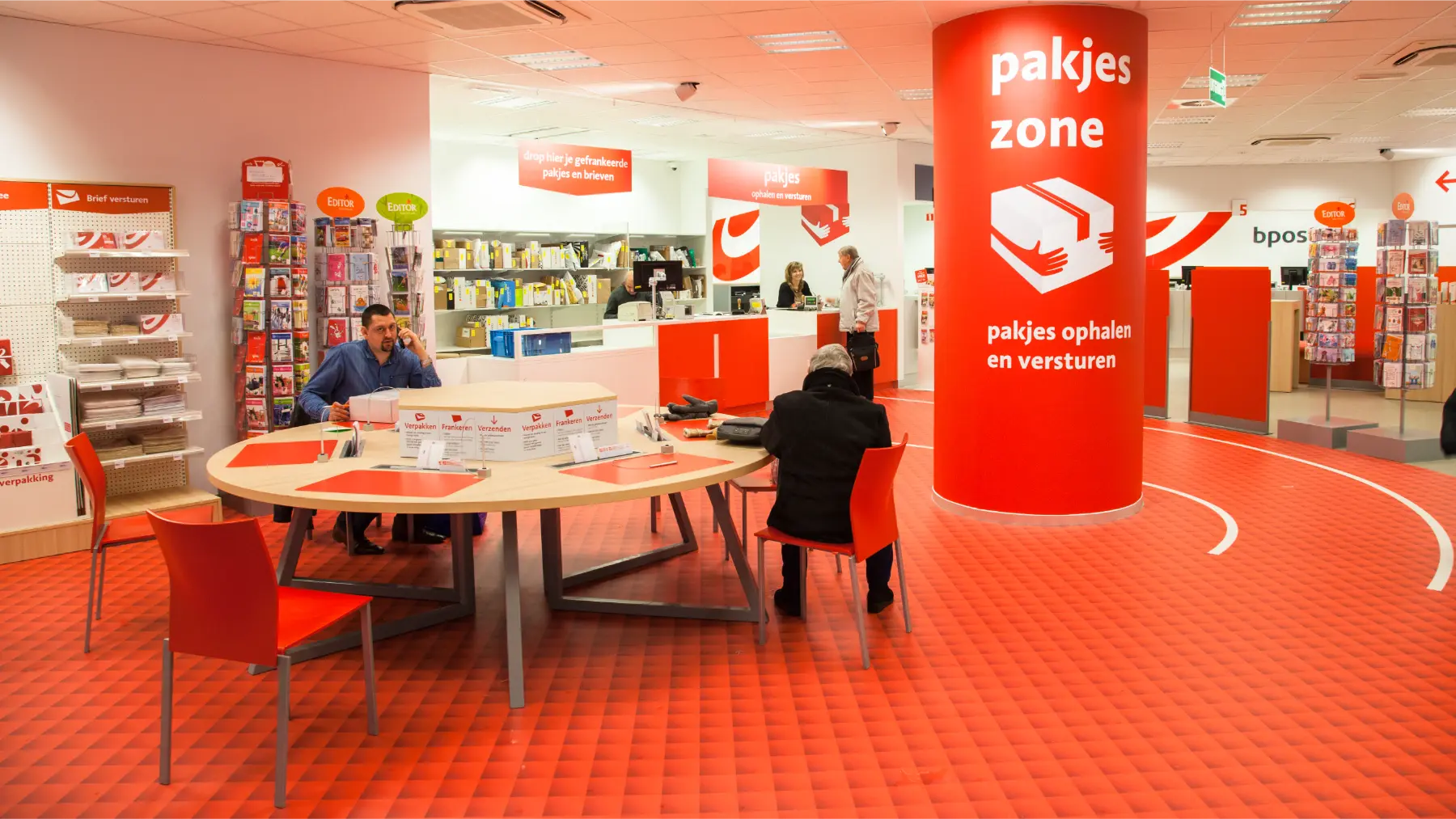
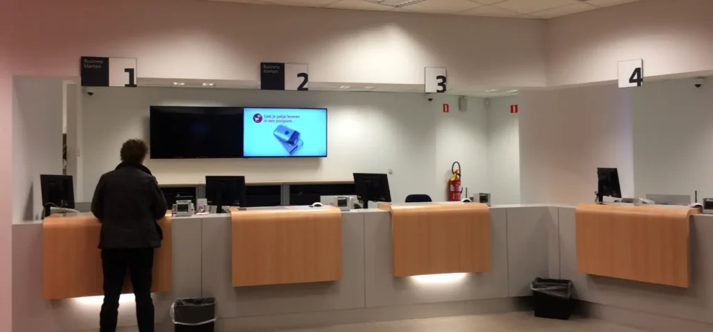
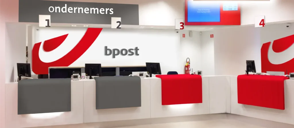
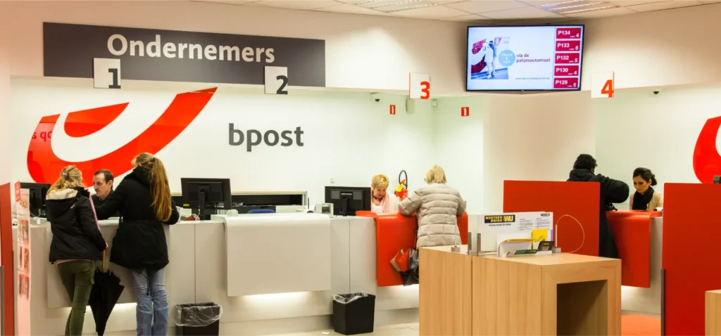
Before > design > after

Mockup video
Interior guidelines excerpt (13 of 62 slides)
Shopfront guidelines excerpt (11 of 35 slides)
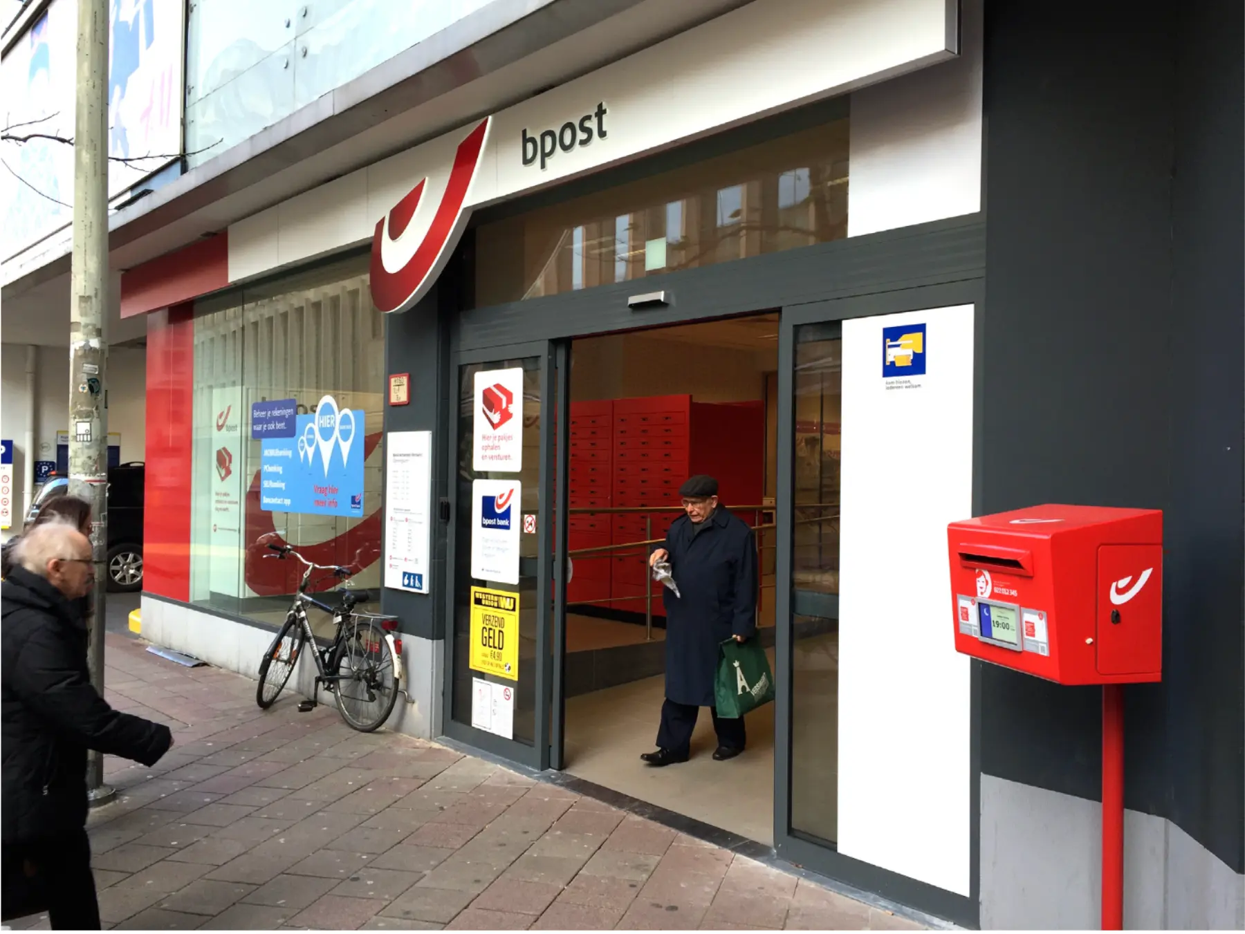
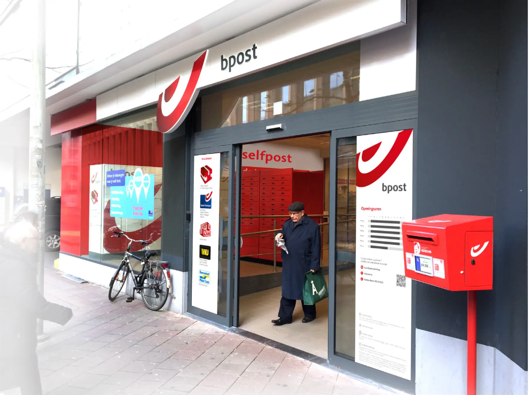
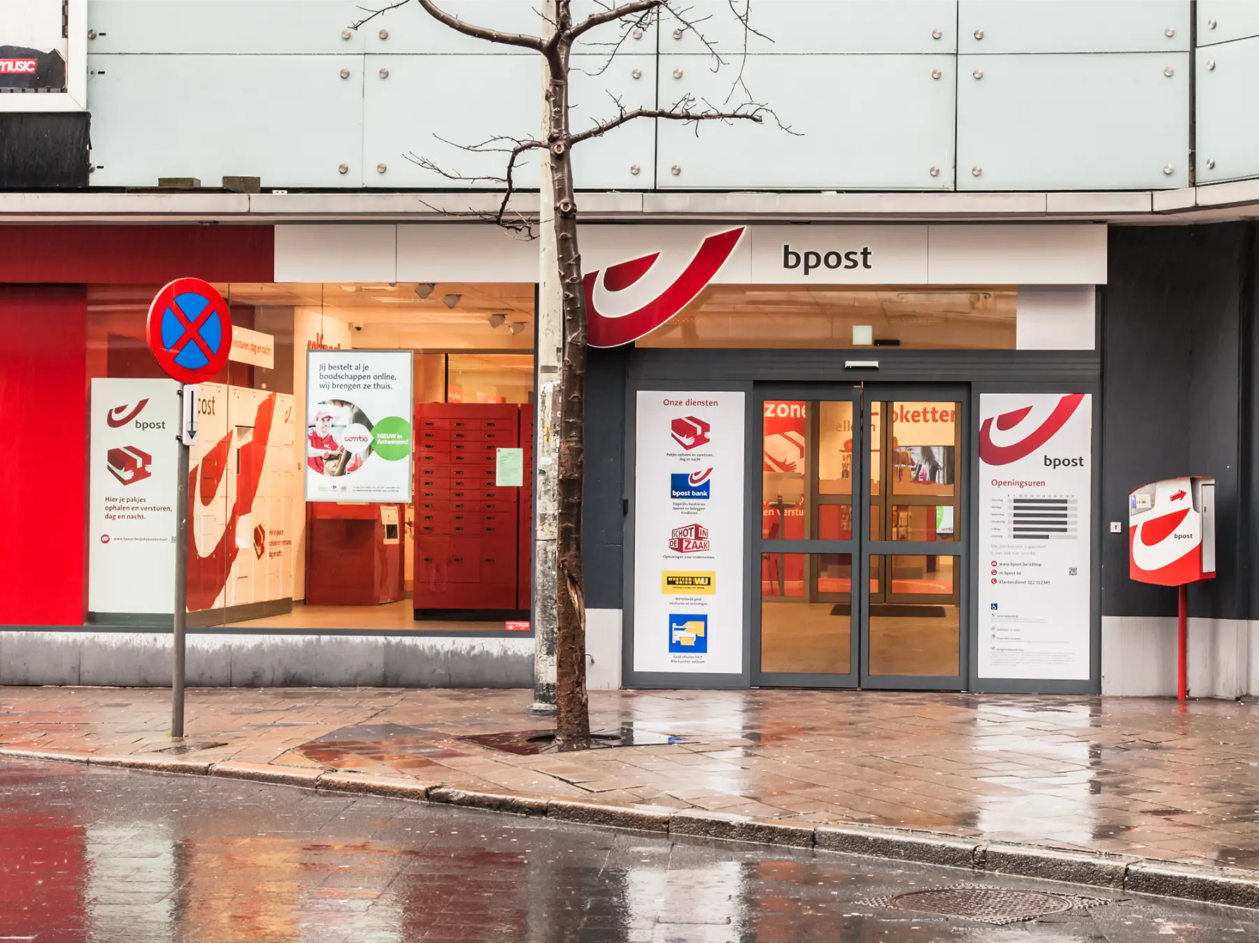
In 2014, bpost, the Belgian national postal service provider went through a full redesign of its physical store concept. A first pilot location was tested in Antwerp but sadly did not resonate as anticipated with customers.
To understand where issues arose before the planned national roll-out, bpost commissioned Carré Associates to run an in-depth “Shopper analysis”. The insights from this research would then be used by Carré Associates’ own design team to bring easily implemented adjustments to the Antwerp store. If successful, these would then be integrated in the final roll-out concept.
Sector: Service
Scope: Full analysis to post-opening
Role: Senior Retail Designer
Collaboration: Carré Associates
Date: 2015-2016
Location: Belgian roll-out
The in-depth customer research conducted by Carré Associates’ analysts highlighted the following key issues:
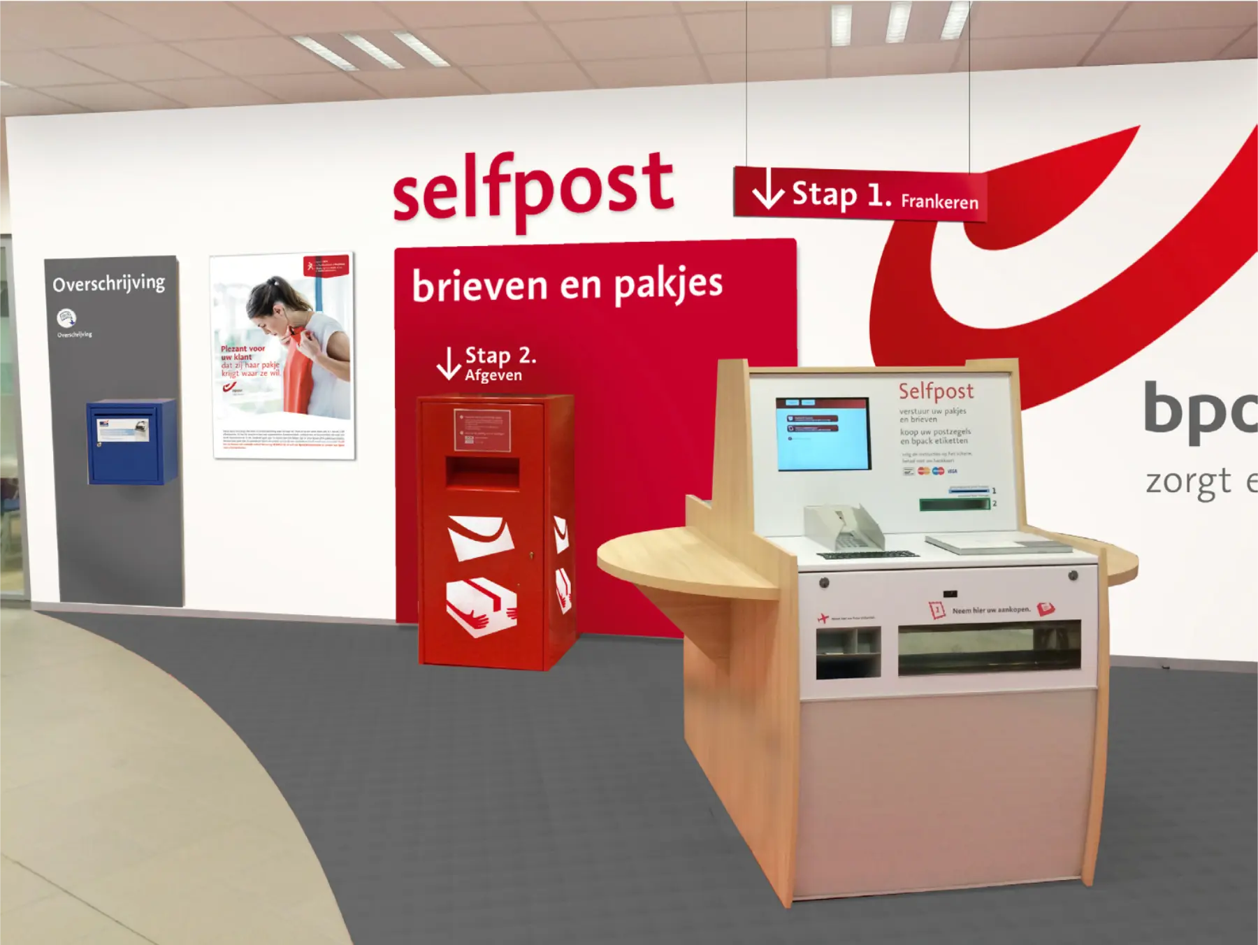
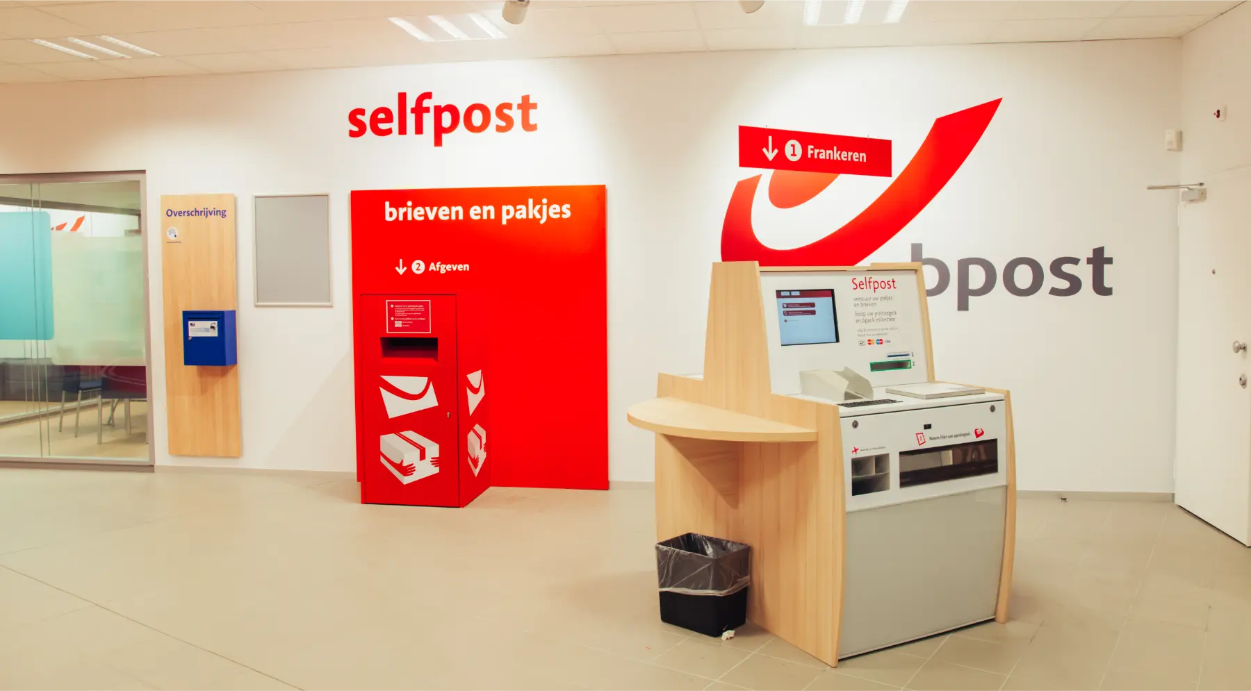
This served as the creative brief for the pilot store concept “touch-up”. Given the above, and the considerable amounts already spent, we decided to focus our work on signage. We strategically reviewed the customers’ key needs in parallel to the retailer’s offer and the store’s set-up. From there, we created a clear set of signage elements to assist customers throughout their various potential journeys.
The pilot refurbishment was a great success. bpost thus asked us to create two different design guides to help them roll-out our concept ideas throughout all the stores: one for the shopfront and one for the interior fit-out. To help them familiarise themselves with these guidelines, we assisted them in the first few store refits before leaving it to their in-house team to run on their own.
My role within Carré Associates was to lead the design team on this project. I liaised with our research team to receive as full a picture of their research results as possible. I visited the site for a thorough audit and some customer observations of my own.
We then worked with other retail and graphic design colleagues to find light touch solutions focusing on signage elements. The graphic team developed the various elements in 2D form and I then implemented them in 3D form via photo mock-ups and a Sketchup model video allowing a full view of the customer journey. Once signed off by our research team, we presented together to the client.
The scheme was then developed into intention drawings for bpost to take forward for construction and implementation. After completion, I visited the site with the client for snagging. Notes from this visit were used to adjust the design intentions.
For the remaining parts of the scope I worked alone with a graphic designer colleague to develop the design guides. I also prepared all the other additional store drawings myself.
Do you have a similar project and need help?
Before > design > after
Mockup video
Interior guidelines excerpt (13 of 62 slides)
Shopfront guidelines excerpt (11 of 35 slides)